Using Pinterest I collected together some ideas on environment photography.
Class Task 1-Public places
|
Scott Fortino is an ex Chicago police officer who photographed residential and institutional spaces such as police station holding cells and public schools. The photographs are described as exploring "the psychology of confinement and protection".
For this task we had to go round school and capture empty class rooms that once had people in them or were once full of activity. |
|
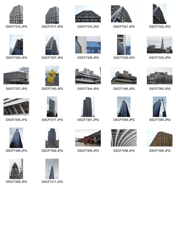
Contact sheet
My Images
|
|
I successfully captured an abandon environment that once had people in it, for example by taking advantage of the contrast the natural light brings into the classrooms . If had experimented more with taking close up shots and using more creative angles this task would have been completed more successfully.
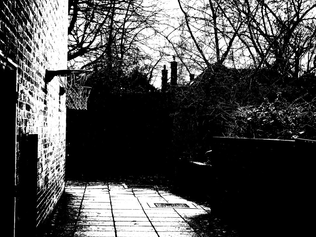
Development 1-High contrast
|
Inspired by the black and white photography of of Keld Helmer-Petersen, titled 'Black Nosie' the first development my class and I tried, was making the contrast on an image high. By heightening the contrast, Keld Hemler-Petersen created a dramatic contrast of tone, the aim is to bring this out in one o f the photographs we have taken.
|
|
Process
|
|
Final Image
|
I am happy with this photograph because I like the way the black and white contrast picks out the trees and the basket ball net. However I think this image would have been more successful if there were less big patches of black. This could have been prevented if I had changed the aperture more effectively.
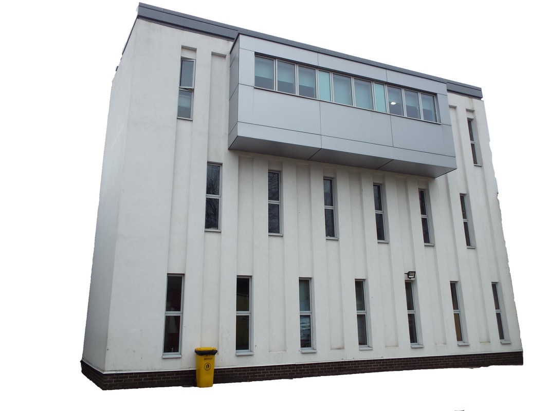
Development 2-Dissect
Process
|
Final image
|
I am happy with this image because I successfully removed part of an image, make it look out of place and isolated. However the image would have been more effective if I had isolated a more interesting shaped building.
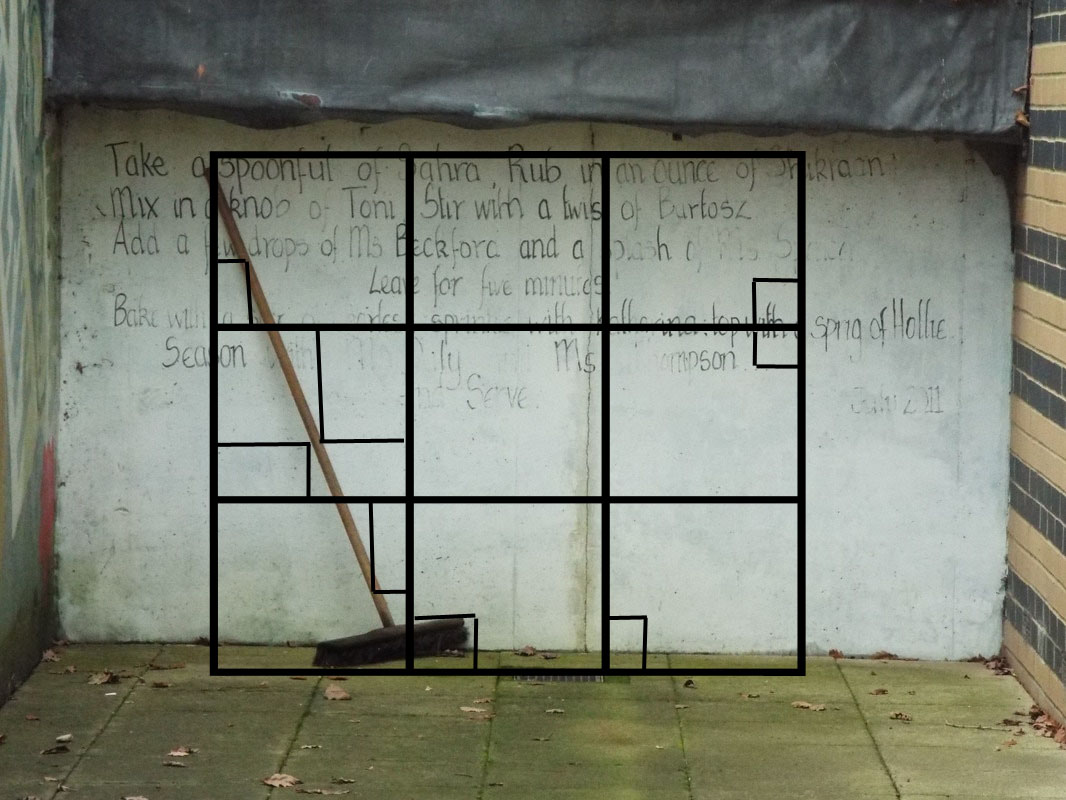
Development 3 -The beauty of mathamatics
|
Nikki Graziano is a photographer and mathematician who decided to incorporate her mathematic skills into her photography. She calculated the formula of certain lines and angles in her photographs and then placed graphs on top of the images.
|
|
Process
Final image
|
I think I successfully picked out parts of the image, bringing light to the interesting angles with in the image.However if I had been able to use a tool similar to the one the artist used that calculates the sum of lines, then my image would have lined to the artist better.
Half Term Work
Perspective-Looking Up and looking down
Contact sheet
|
|
|
I feel that I effectively created interesting photographs by positioning my camera at a worm's- eye - view angle, however if i would have for-filled the criteria of this task better if I had taken more bird's - eye - view images.
Abstract thought
Contact sheet
|
|
I feel that I effectively captured abstract thoughts and people reacting to a change in their environment through the bubbles and the peoples excited reactions to them. However if I had managed to capture people at a circus or fairground then I have been able to photograph people reacting to different things.
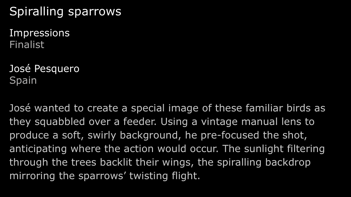
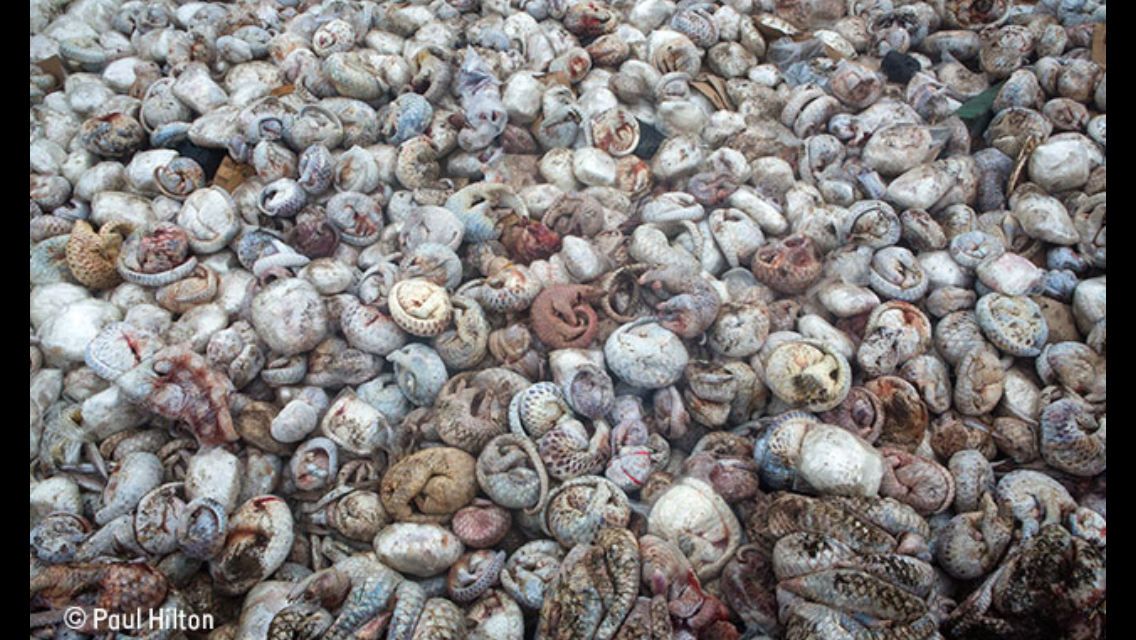
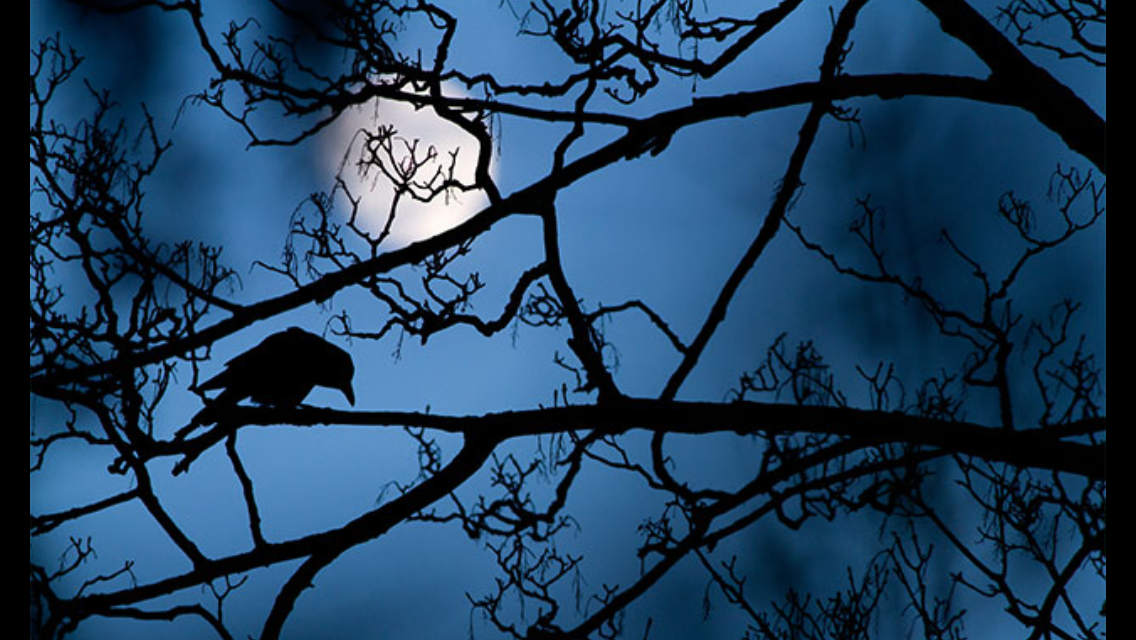
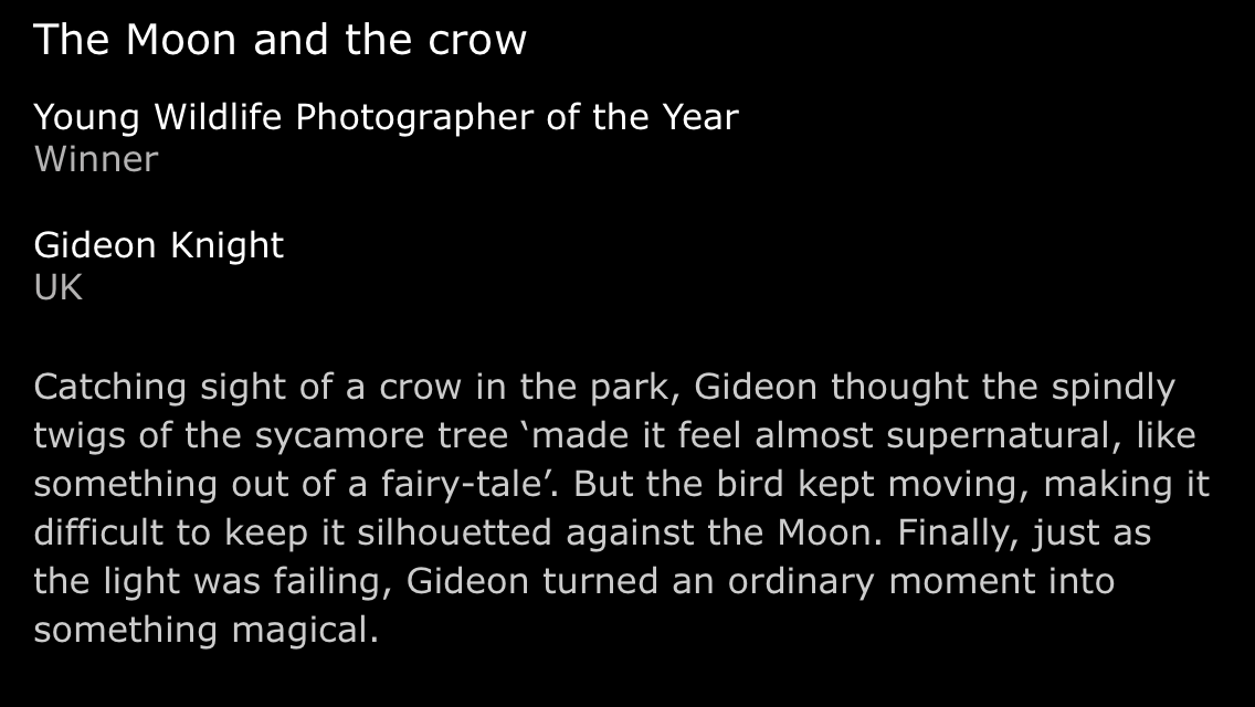
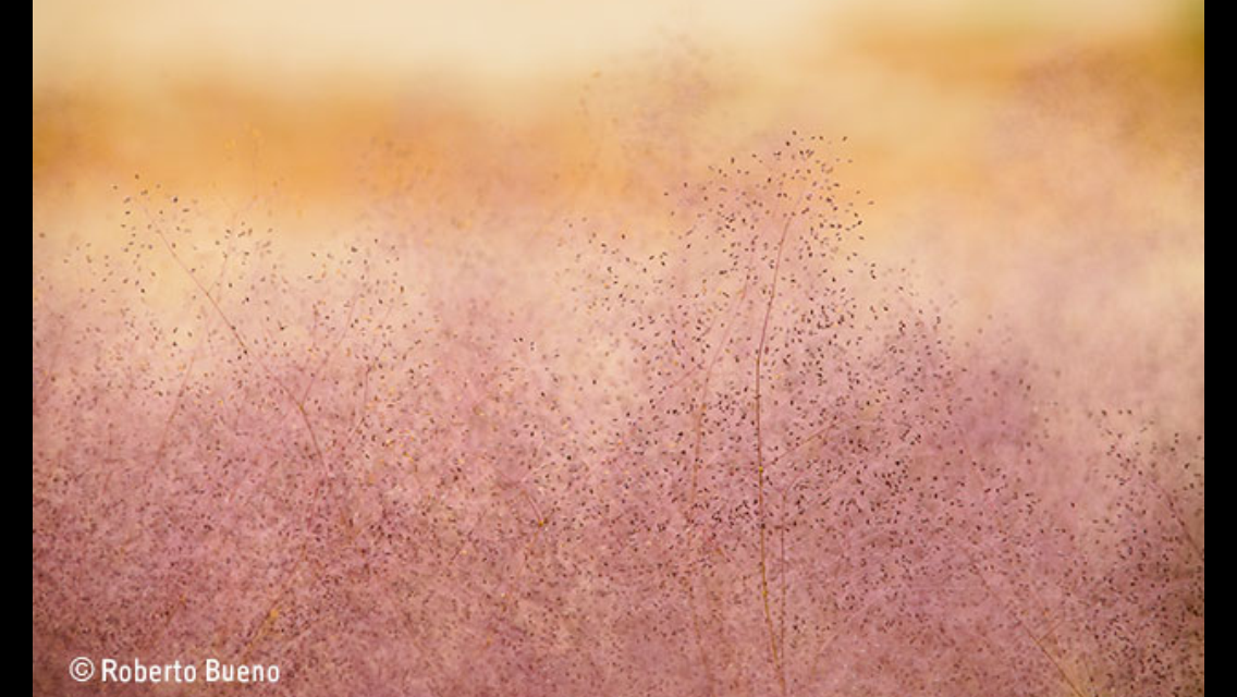
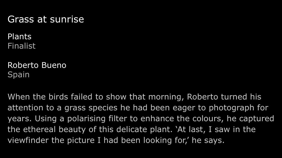
Exhibition Visit- Wildlife Photography of the Year Award
|
The exhibition features all the finalist and the winners of each category. The categories were:
|
Exhibition introduction
How the competition is judged
|
Favourites
|
|
|
|
|
|
|
|
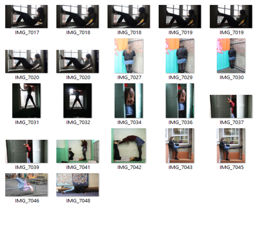
Class task 2-People in small spaces
|
Willi Dorner is and Austrian photographer. In 2009 he and group of performers, climbers and dance went to Norway, Finland, England, Austria, Sweden the US and France, so he could photograph them in tight and cramped spaces.
|
|
Inspired by these two photographers our task was to go round the school and take photographs of people in tight and cramped spaces.
Contact sheet
|
My Images
|
|
I feel I successfully captured people in small and cramped spaces, however I could have made my photographs more interesting by experimenting with how the subject fills the space.
Class task 3 - Fake environment
|
Aaron Farley is a photographer and director who was born in the outskirts of Spokane in Washington and now lives in Los Angeles. He created fake environments by using photographs of clouds and water and merging them together after rotating and cutting them, to create landscapes that look real. He also used depth of field to blur parts of the image, in order to make it look more realistic.Our task was to try and create some fake environments ourselves.
|
|
Contact sheet
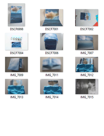
My images
|
|
For this task I sucessfully merged two images together to create a fake environment. However if I had used the depth of field technique more successfully then the images would have looked more realistic.
Homework task 1 - Public spaces
for this task we has to continue to take photos of empty public places inspired by the work of Scott Fortino
|
|
I believe I successfully photographed abandoned public places that were once full of activity. I achieved this by photographing a park and playground in the early morning, which was once and was soon to be full of children. The photographs would have been more successful if I had used more interesting angles, and I could have developed on this by trying to capture the environment through the eyes of a child.
Homework task 2- Personal places
For this task we had to take photographs around our houses displays the personal ways people decorate their homes.
|
|
I believe I effectively photographed small ways my family decorates and furnishes our home, from the tea pots in the kitchen to the speakers in the living room. However I would have completed the task better if I had photographed other houses as well as mine, because I would have been able to pick out more interesting elements of someone else's home.
Exhibition Visit - The Radical Eye: Modernist photography from the Sir Elton John collection
|
|
Worksheet
|
Room 1-The Radical Eye
|
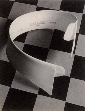
Name: Ide Collar
Date: 1922 Photographer: Paul Outerbridge This is a photograph of a collar but because of the positioning of the collar and how it has been distorted, it takes the views a while to realise what it it. The main focal point of the image, is the contrast of the colour and shape, which draws the viewers attention to the background.
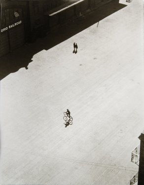
Name: Boy on a Bike Below Brooklyn Bridge
Date: 1922 Photographer: Ralph Steiner In this photograph I think Steiner wanted to draw the attention to one person to show the loneliness and the bleakness of the location he was photographing.
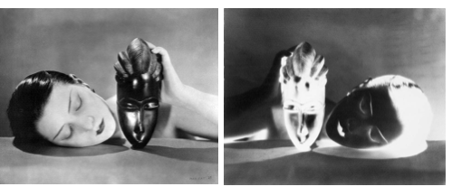
Name: Noire et Blanche
Date: 1926 Photographer: Man Ray This photograph brings to light themes of race due to the juxtaposition between the West African mask and the woman. He also flipped an negative version of the image, heading light on the process and introducing a symmetry between the to images.
|
Room 2-Portraits
|
Room 3-Portraits/Bodies
|
Name: Corner Portraits
Date: 1948 Photographer: Irving Penn For this project Irving Penn took photographs of artists, musicians,politicians writers, dancers, as well as other celebrities, and asking them to position themselves in a small corner he created using two studio flats pushed together and a carpet on floor. Each pose that his subjects give are different, I described each of my favourite poses with one word. ( see slides opposite) |
Room 4-Experiments
|
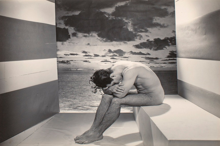
Name: A Forgotten Model
Date: 1937 Photographer: George Platt Lynes This photograph looks very abstract and is very intriguing. The stripes on the wall in the photographs draw the viewers eye to the background of the image, making the viewer question the meaning of the sea in the background and why the subject appears fed up.
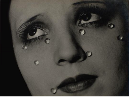
Name: Glass Tears
Date: 1932 Photographer: Man Ray This surreal photograph of a woman looking to the left away from the camera with glass spheres on her face, is very thought- provoking. It makes the viewer wonder what the glass tears mean. I thinks they link to the idea of constant or never- ending sadness. This interpretation links to what was going on in Man Ray's life at the time. During 1932 Man Ray was splitting up with his partner Lee Miller, also a artist and photographer. Therefore he probably was quite upset a lot of the time.
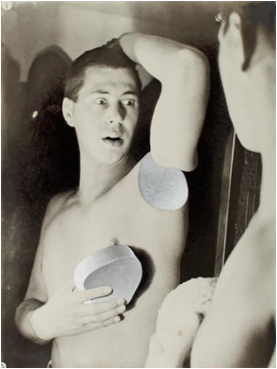
Name: Humanly Impossible
Date: 1932 Photographer: Herbert Bayer This self portrait is famous four it's surreal and comical tone, and the viewer is instantly drawn to the subjects expression and hand. To create this photograph Bayer used a technique called photo-montage. as well as this the photograph is a gelatin silver print on airbrush paper.
|
|
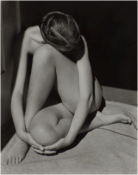
Name: Nude
Date: 1936 Photographer: Edward Weston In this image the subject appears very relaxed, but her distorted position, her hidden face and the black and white brings a seance of mystery to the photograph.
|
Room 5-Documents
|
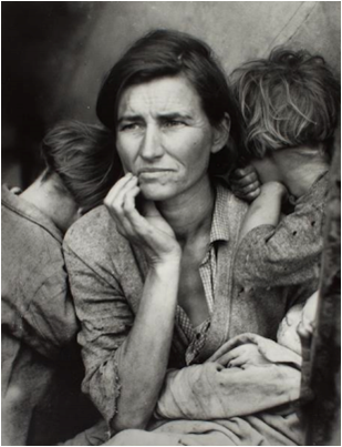
Name: Migrant Mother
Date: 1936 Photographer: Dorothea Lange 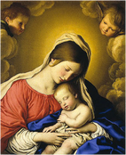
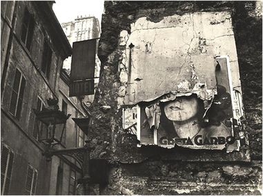
This famous photograph is of Florence Owens Thompson and two of her children. This photograph was used to show the impact of the Great Depression on American people. The photograph has been dubbed "Destitute pea pickers in California" by the Library of Congress. When taking this photograph Lange took five exposures, moving closer to the subjects each time. As a result, Lange was able to crop the photograph in a very precise way, which makes the photograph look well framed and some what set up.The composition of this photograph is similar to the painting The Madonna By Giovanni Battista Salvi Da Sassoferrato. (Right corner) This links to the contrast in the amount of respect each mother has. Name: Greta Garbo Poster
Date: 1932 Photographer: Ilse Bing Bing created distance between the viewer and the poster in the photograph by taking the photograph at a low angle. This distance represents the respect people have for celebrities such as Greta Garbo. However because the poster is decaying it creates a seance of irony. This photograph links to the idea of the America dream, and suggests that it is impossible to achieve or is an illusion because nothing is ever how it seems, and objects and ideas eventually lose their appeal.
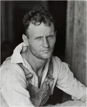
Name: Floyd Burroughs
Date: 1936 Photographer: Walker Evans This portrait of a cotton sharecropper instantly draws the viewer to the mans blank and staring expression and his clothing which tells the viewer exactly what his profession is. The contrast between the dark background and the brightly lit man directs the viewers gaze to the subjects face. As well as this Evans used depth of field to guide the viewer to focus on the subject.
|
Room 6-Objects, Perspective, Abstraction
|
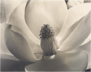
Name: Magnolia blossom
Date: 1925 Photographer: Imogen Cunningham This is a photograph is a gelatin silver print of a flower called a Magnolia blossom. The lighting in the photograph brings out the texture of the flower leads the viewer to focus on the centre of the flower and the detail the photograph captures.
|
|
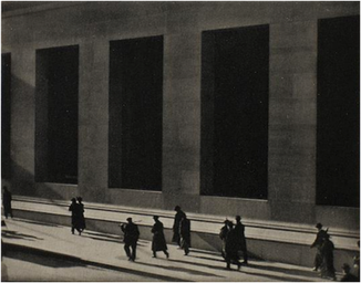
Name: Wall Street
Date: 1915 Photographer: Paul Strand Strand took this image by tilting the camera to the left, directing the viewers eyes to follow the people walking. The angle and black and white tones emphasises the structure of the building.
|
|
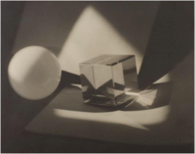
Name:
Date: 1923 Photographer: Jaromír funke This black and white photograph includes a spear and a see-through cube. The light has been angled so only the centre of
the photograph is lit. However the shape of the light is distorted. This caused by objects in the photograph and causes the objects too appear distorted too. |
Class task 2 - Small spaces extented
|
Irving Penn was an American photographer who was born on the 16 June 1917, and died on the 7th October 2009. He is know famous for his still lifes, fashion photography and portraits. In 1948 he publish a project called Corner Portraits, in which he photographed different people siting in a corner. He wanted to show how different types of people behaved in the same environment.
Inspired by the work of Irving Penn our task was to take photographs of people in a corner in our classroom. |
|
Contact sheet
My Photographs
Class task 2 - Small spaces extented
|
|
I feel that the first part of this class task, taking photographs of people in a corner was more successful. This is because the subjects were more comfortable in the corner,which made photographing them easier. With the second part of the task, it was more difficult to think of interesting ways for the subject to position themselves.
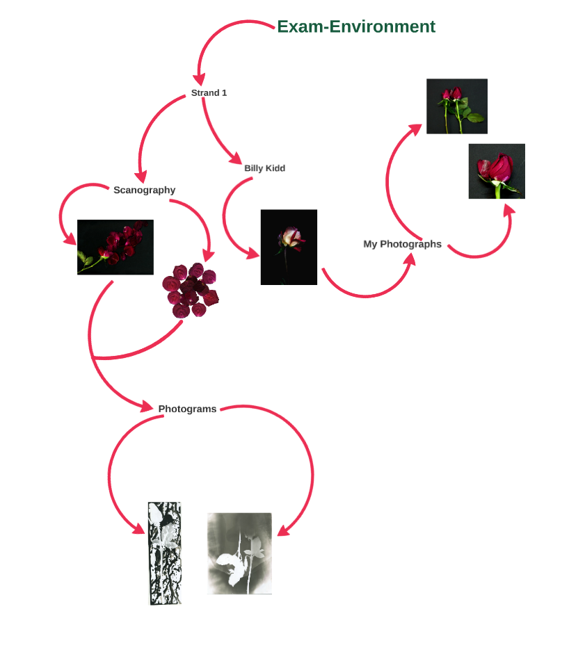
Strand 1- Decaying flowersBilly Kidd photographed decaying flowers using a black background and a single light source. His photographs show the beauty of dying flowers.
This links to enviroment because the photographs feature example of how the environment naturally decays and dies. |
|
Scanography
|
As well as this I also wanted to experiment with scanography by scanning the decaying flowers and arranging them in a pattern. I could then develop this strand further by mirroring the images I create.
|
|
My Billy Kidd inspired photographs
Contact sheet
|
|
My Photographs
|
|
Artist and me
One of the differences between my work and Billy Kidd's is that he used a variety of flowers where as I only used roses. This was because I liked how different the roses looked from each other, each with their petals arraigned in different ways. Another difference is that I photographed two/three flowers at a time as well as doing single flowers. This is because I wanted to capture the differences between the flowers and the differences in the petal arrangement. Another difference that I also photographed the flowers with lose petals that had fallen off the roses. This allowed me to present the flowers in a different ways and shows the petals in different forms. A similarity between my work and Kidd's work is that we both used black backgrounds. This brought out the colours in the flowers that were slowly fading and made the photographs more dramatic.
My Scanography photographs
Contact sheet
My photographs
|
|
Photograms
Inspired by this task I also decided that I would experiment with photograms which show off the silhouette of the flowers.
Inspired by this task I also decided that I would experiment with photograms which show off the silhouette of the flowers.
My Photograms
|
|
I believe I successfully captured the vibrancy of the flowers Like Kidd did, and I also successfully developed from the original idea by creating photograms, I was especially happy with the splattered one. However I could have linked the task to the artist better I had had a verity of flowers, and I had used the same technique to photograph the flowers.
Visual brainstorm
|
Stand 2- People and there environment
|
Camilla Catrambone took what she called portrait of her family by using objects she assisted with them. On her website she said "These portraits aim to represent my family members trough the objects they've owned"
This links to environment because it links to how people influence the environment around them and links to how w associate certain objects with people. |
|
Contact sheet
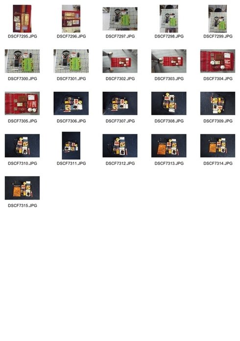
My photographs
I think I successfully represented my family through objects that belong to them. I could have linked this task to the artist better if I had used more objects and taken several different photographs to describe a person.
Artist and me
The main difference between my work and Camilla Catrambone's is that she included more objects in her photographs to describe her family members. I decided to use less objects because I thought it would make the photographs less busy. As well as this, Catrambone used similar objects in order to describe her family members ( see slides 1+2). I decided to use different and unrelated objects to try and represent many different aspect of my family member's personalities. One similarity between my work and Catrambone's is that we both used different backgrounds for each photograph. This is because the background added to the description of the family member and allowed each photograph to have a different tone and theme. Another similarity is we both tessellated our objects and arranged them carefully.This made their positioning look purposeful and made the photographs look neat.
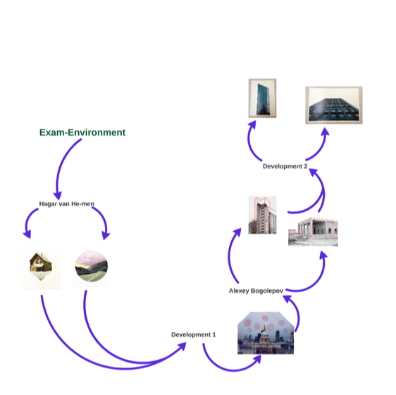
Strand 3 -Stiching
|
Hagar van He-men has been working with paper and thread for 10 years she says "Working with thread allows me to create a new physical, tactile layer on top of existing photos. A layer that was not there before. Adding a new dimension to the surface, a new view, and with that a new meaning."
This links to environment because the stitches change and emphasise certain parts of the environment. |
|
Contact sheet
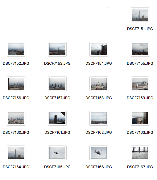
My photograph
|
I think I successful picked out parts of the photograph that weren't very noticeable,especially with the yellow and blue thread. I also think I successfully Incorporated to sewing styles into the photograph, with the triangular bubbles and the outlining. However I think using so many different colours made it too busy.
Artist and me
My work shares some similarities with Hagar van He-men work. One similarity is that we both used a triangular/ webbing technique when sewing. This creates a visual connection between the empty space, (the sky) and the filled space, (the mountains/ buildings) in the photograph. Another similarity is that we both used coloured tread to enhance parts of our photographs, however we do this in different ways. Hagar van He-men does this by highlighting the negative space (slides 1+2 above) and by using geometric shapes to highlight the space and to connect two photographs. Where as I uses tread to pick out the outline the buildings, and highlighted the negative space in a smaller way.
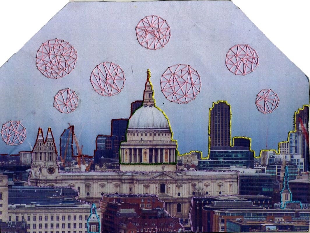
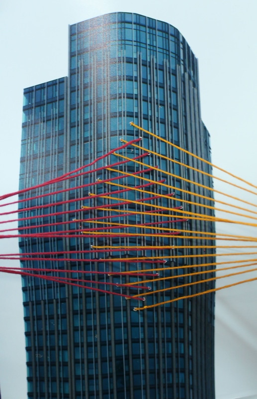
Development 1-Developing strand 2/sewing
|
I decided to develop strand 2 by focusing on isolating building and picking out the structure in my photographs with thread. This development was inspired by the photographer Alexey Bogolepov.
|
|
Contact sheet
|
My Photographs
|
|
I feel that with these photographs I successfully produced a good amount of tension on the thread which make the lines precise and straight. As well as this I successfully displayed the idea of just sewing the outline of the buildings and not making the picture unnecessarily busy, by simplifying the sewing. However it would have been more effective if I had restricted to one or two colours, and if I had used better images because the silhouette of the trees in the second image meant the lines were difficult to see and sew.
Artist and me
One way my work is similar to Alexey Bogolepov is because we both used lines to pick out the structure of the building in our photographs. However, our work differs because Bogolepov uses only one colour to pick out the structure where as used two or three. This is because I wanted to pick out different parts of the structure and because I wanted the viewer to be able to distinguish between these parts. The main difference between our work is that I Incorporated thread into the photograph instead of lines. I did this to follow on a link to my previous strand and because I wanted to carry on developing the idea of using thread to change an eviroment. Lastly, my work was also different from Bogolepov's because his photographs were black and white where as mind weren't . I decided not to make mine black and white because I wanted to show a contrast between the brightly coloured thread and the industrial and dull colours of the buildings I photographed.
Visual Brainstorm
|
Development 3
I decided to develop by creating a 3-dimensional structure consisting of two photos connected by thread.
I was happy with the structural element of this creation and how the structure meant that both images were visible. However I struggled to create tension in the tread, resulting in it not looking precise and looking less effective. I could also improve on this piece by giving the threads more direction instead of sewing randomly from on photograph to the other.
Development 4
I decided to develop by just using one photograph with the tread going to a fixed point.
|
This did work well because I created a different type of a three-diemtional structure and my threads had direction. However I have decided that I want to develop by using thiner thread, so that the colours blur together more, and I also want to move back to using a three dimensional structure because it incorperates more photographs and the treads more.
What I hope to create but on a smaller scale -Thread installation
|
|
How to video
|
|
|
Development 5
In preparation for the installation above I created a mock up using foam board and butterfly pins.
|
When creating this mock up I struggled with creating tension, because the image kept on getting pulled forward by the thread, making the thread loser. I managed to improve on this with the orange tread by raping it around the butterfly pin several times, before pushing the pin in. This gave the tread more tension and allowed me to go back to the blue tread and do the same, more tension would still have improve the sculpture.
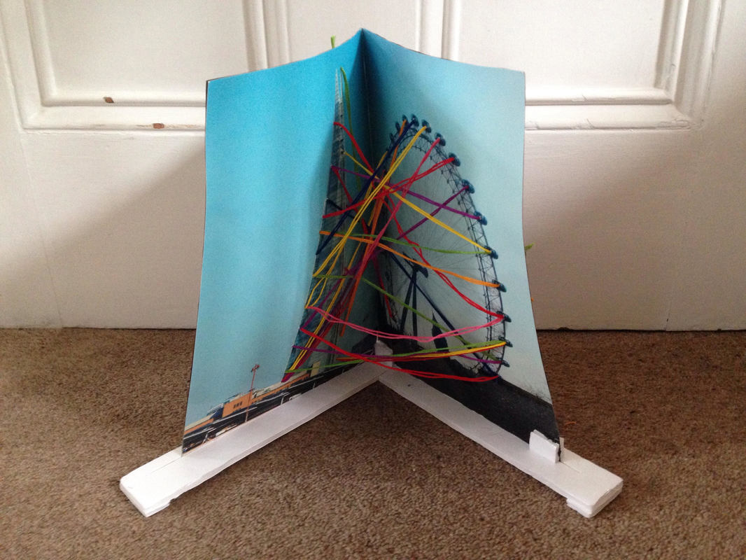
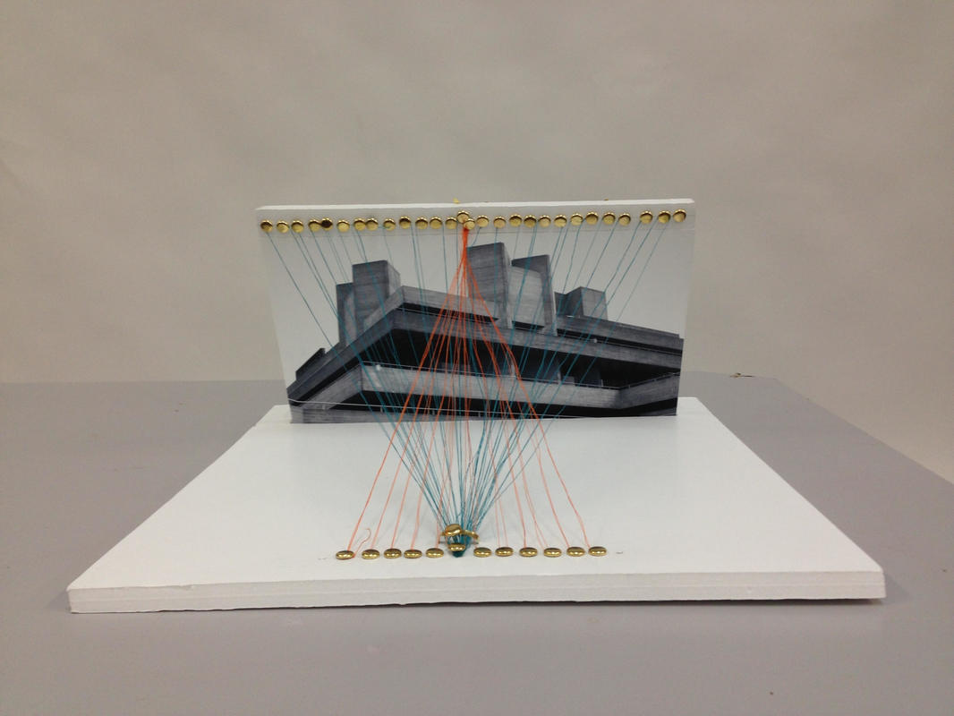
Final Piece
For my final piece I decided to create a large three dimensional structure with two photographs at a right angle on a wooden frame. As I created the structure I photographed the process.
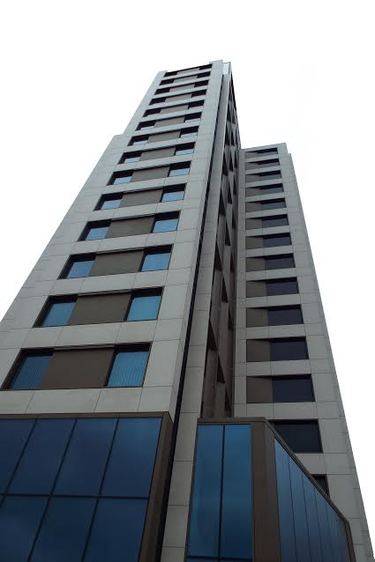
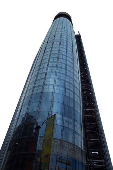
The photographs I used in my final piece
|
|
decided to use these photographs because the isolation looked effective and because I liked the low angle I used to take both photographs.
Process
|
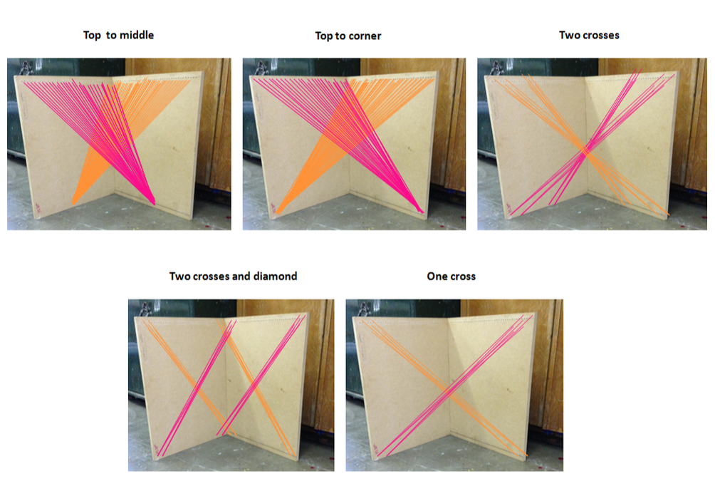
Different design ideas
|
Before I added thread to the structure I outlined some different design ideas. I decided to choose the top to corner design because the thread creates a attractive cross-over which will merge the colours together well. I choose pink and orange as the colours because, i wanted colours that contrasted with the ones in the photographs and because I was inspired by the orange and pink thread installation above, created by the artist Anne Lindberg (slides 1-3).
Artist and me
Clearly there are a lot of differences between my work and Anne Lindberg's . The main one being that mine is on a much smaller scale for practicality reasons, such as being able to move and not have it in a fixed position attached to the wall. Another difference between my work and the artist's is that I incorporated photographs into my work, so that it links to my previous developments. There are also some similarities between my work and Lindberg's, one of them is that we used the same colours in our work. I chose the colours orange and pink to create a contrast between the bright colours of the thread and the dull industrial colours of the buildings in the photographs. Another similarity between our work is that we both sewed from one corner to another, although I did do so in a different way from Lindberg.
Evaluation
My final piece was inspired by the idea of creating a thread installation/ sculpture. I was mainly inspired by the artist Anne Lindberg. There were several aspects of her work that I wanted to recreate in my own. These aspects were, the tension in the thread, how the colours used blurred together and how the thread emphasises and seems to enlarge it. I created tension in the tread by pulling the thread tight at both ends and tying knots round the nails, after wrapping the tread several times. I am happy that I managed to create enough tension because it made the sculpture look neat and professional I feel I also successfully blurred the colours together. I achieved this by choosing colours that had similar tones which made them blend together well. I feel that I emphasised and appeared to enlarge the space, because of the direction I chose to put the treads in. I believe going from a row of point to one fixed point created this enlarging illusion and effect. I am happy with how I developed from doing a two- dimensional creation to doing a three-dimensional creation because it allowed me to incorporate the thread and photographs together in an interesting way. Finally, I believe I successfully developed from the exam title environment because I changed the environment and the way people view it, by adding coloured thread to it.
