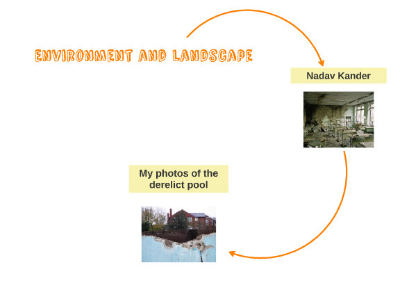
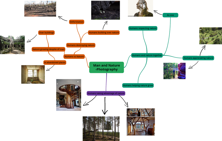
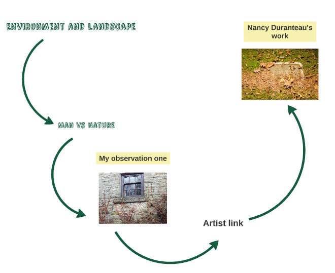
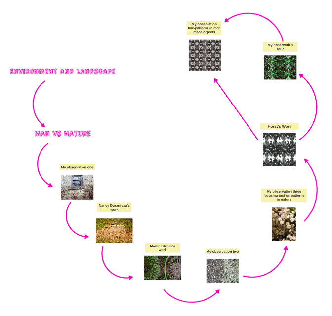
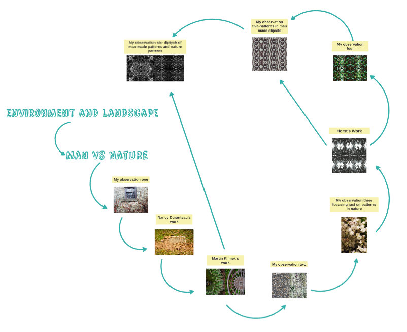
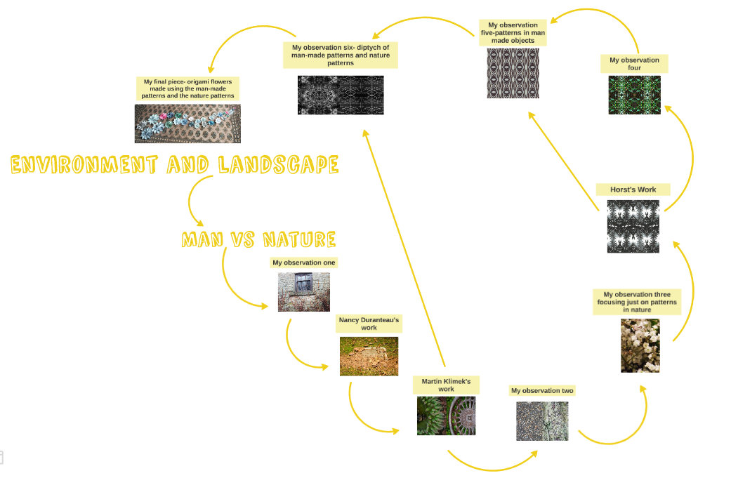
Mind Map
To zoom in see: https://prezi.com/coshpz6x0p8x/environment-and-landscape/
About Nadav Kander
Nadav Kander was born in Israel on the 1st of December 1961. At the age of three he and his parents went to live with his grandfather in South Africa. He lived their till he turned 21 in 1985 and then moved to London. He began taking photos at the age of 13 with a Pentax camera that he bought with his Bar Mitzvah money. His first solo exhibition was in Los Angeles at the Peter Fetterman Gallery, and his most recent solo exhibition was of his project Dust at the Torch Gallery in Amsterdam in 2014
Nadav Kander Half life project
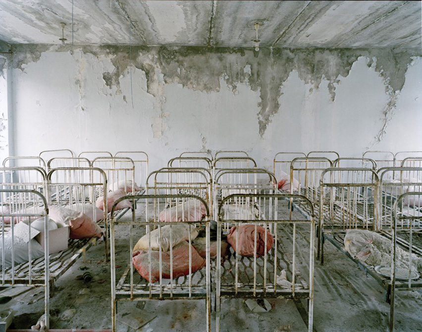
The project was based around the abandoned city of Chernobyl which was left derelict
after the nuclear reactor Reactor no.4 exploded in 1986 resulting in many having to leave their homes , memories and belongings behind. Nadav Kander 's project portrays what the abandoned city looks like 20 years after the disaster.
|
Form: The broken and abandoned beds that are still all in formal lines, signal how the uniformity has been lost. As well as this the crumbling walls ad to the felling that every thing is slowly decaying and fading a way.
Process: The Photographer used colour contrast between the white and pale walls and ceiling and the red pillow cases. this contrast makes the image more striking. he also took advantage of the natural light which gave the image a harsh brightness. Keywords:FADING, UNIFORMITY, DECAYING, LOSS OF STRUCTURE,DISAPPEARING Context: This photo effectively displays the decaying and disappearing aspect that the photographer wanted to create. IT does this through how it captures the decaying wall and also because the the hint of red dye in the pillows looks like blood, which represents how everything in Chernobyl as been left to slowly die. |
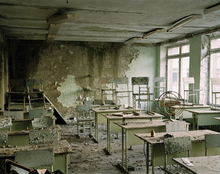
Form: This image displays a crumbling class room with crumbling walls and wooden pan rotting but intact chairs and tables.
Process: No specific process was used when taking this photo, however the photo cleverly captures the part of the class room which hasn't begun to rot and the part that is far into the process. it shows a gradient of this process. This makes the fact that everything is slowly crumbling and rotting one by one. it also hints at horrible sight to come when this class room has completely rotted away.
Keywords: CRUMBLING,ROTTING,DISAPPEARING,
Context: Through this photo the photographer wanted to portray how this derelict city had gradually got more and more so and that it will continue to crumble as time goes on. This photo theretofore effectively displays how derelict, abandoned and destroyed Chernobyl is.
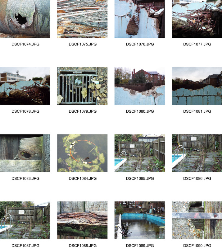
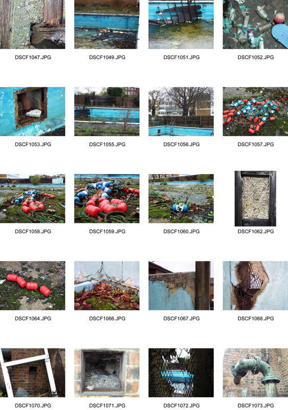
The Derelict Pool
Our task was was to take photos of the schools abandoned swimming pool inspired by Nadav Kander's photos of an abandoned and derelict place.
Our task was was to take photos of the schools abandoned swimming pool inspired by Nadav Kander's photos of an abandoned and derelict place.
|
|
|
|
The artist and me
The main difference between my work and the artists is the location and setting of our photographs. His photographs were taken in an abandoned and very derelict setting that appears to be frozen in time, whereas, although my photos do feature a somewhat derelict location, it is not abandoned. This means that his photos seem a lot more sinister and eerie to the viewer. A similarity between our works is that they do both feature derelict locations. However because my location was less derelict my more featured more close up shots which picked out the most derelict parts, where as his were mostly establishing shots which displayed that a large amount of the surroundings were derelict.
Evaluation
What went well: I think that I successfully depicted how derelict the swimming pool is and that it looks out of place compared to the modern looking school. I think achieved this through the close up shots which depicted the pools deterioration, and I feel that I showed how out of place it looks from images such as one that include the school and the pool in the same image, which allows the viewer to compare the two settings.
Even better if: These images would have been even better if they were more like the artists, but because we were shooting in very different locations it was difficult to do so.
Even better if: These images would have been even better if they were more like the artists, but because we were shooting in very different locations it was difficult to do so.
Visual brainstorm
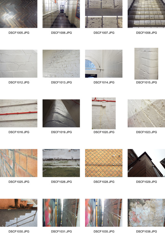
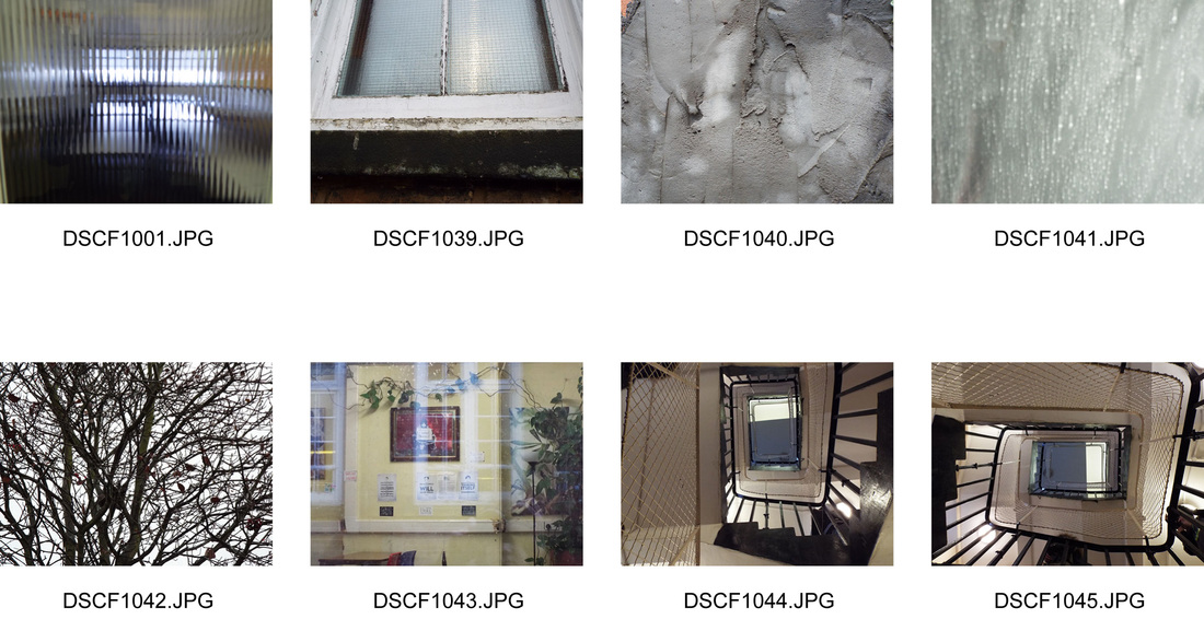
The Formal Elements
Task two was to take photos around the school and the swimming pool and displaying the formal elements. the formal elements are tone,contrast,line,form shape,texture and colour.
Task two was to take photos around the school and the swimming pool and displaying the formal elements. the formal elements are tone,contrast,line,form shape,texture and colour.
|
|
|
|
About Eugene Richards
Eugene Richards was born in 1944 in Dorchester, Massachusetts. After studying at Northeastern University and graduating with a degree in English, he studied photography with Minor White. His monograph included many photos from his time in eastern Arkansas with the VISTA (Volunteers in Service to America). Whilst he was there along with others he founded a social action organisation, and a community newspaper called Many Voices which reported on the violent acts of the Ku Klux Klan and on black political action . He went on to publish seventeen books, his most famous being ‘Exploding into Life’, which is about his wife Dorothea Lynch's struggle with breast cancer. This book won Nikon's Book of the Year award.
Eugene Richards-Blue Room
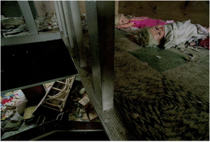
Form: this photo includes lots of old belongings including dolls and old clothing. This presents the viewer with the impression that who left in a hurry. The shot also includes a thin green carpet full of dirt which has had some of its tiles removed. This emphasizes the abandoned feel the photographer wanted the photo to have.
Process: The photographer used a distorted angle and in the shot and the shot is a close up shot which makes the viewer feel uncomfortable and gives the photo an uneasy atmosphere.
Keywords: DISTORTED, UNCOMFORTABLE, ABANDONED
Context: The photographer wanted to present the viewer with the idea that the house had been abandoned and left to deteriorate. it also present the viewer with a slightly uncomfortable feeling because of the way the doll's are positioned as if they are staring at the viewer. They also emphasize the frozen in time aspect of the whole project, as if they are humans or babies frozen in time.
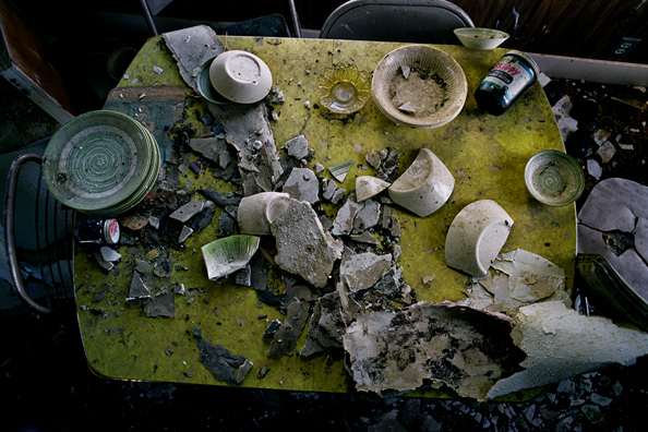
Form: This photo includes lots of smashed plates cups which give the photo a rushed atmosphere. it also includes abandoned and decaying furniture which adds to the rushed and hurried atmosphere of the photo. As well as this the yellow table seem ironic to the viewer because of the happiness it symbolizes and how it clashes with the melancholy atmosphere of the photo as a whole.
Process: This photo is close up birds eye view shot uses colour contrast between the yellow and the darker and duller background produced through natural lighting.
Keywords: RUSHED,SCATTERED,HURRIED,ABRUPT CHANGE.
Context: This photo emphasizes the rushed and hurried atmosphere that the photographer wanted to capture. It also captures the photographers aim of portraying a room that once had life.
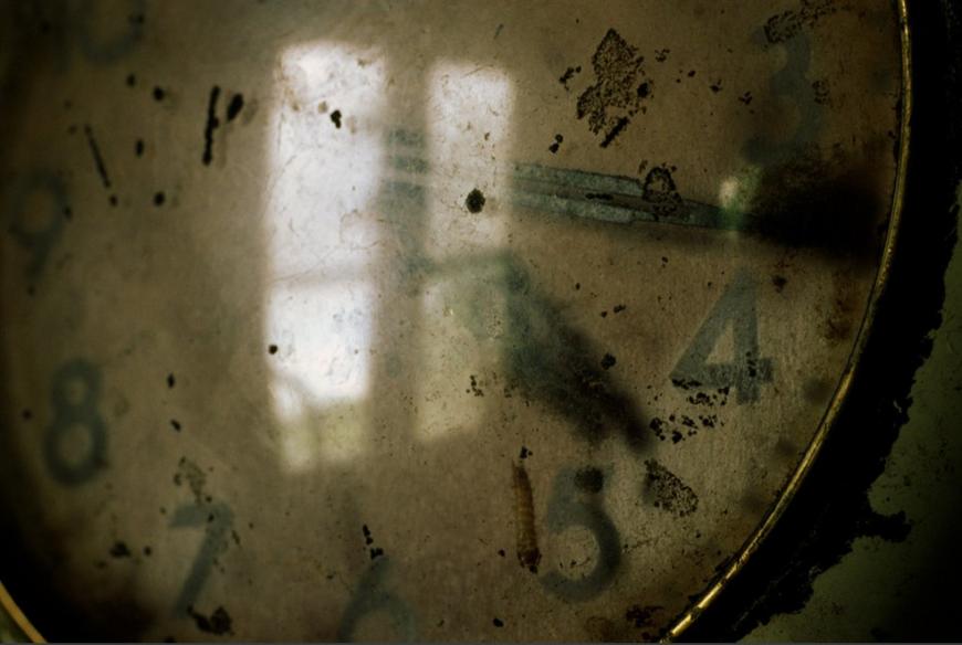
Form: This photo displays a broken and old looking clock which is gathering dust and is slowly decaying and rotting as a result.
Process: This photo a extreme close up shot which slightly out of focus. The photographer also takes advantage of the glass in the clock by using the glasses reflective property to reflect the window in the clock.
Keywords: FROZEN,STATIC,STILL,SILENCE,DECAYING, A GLIMPSE OF LIGHT,LIFE AND HOPE
Context: This photo brings out the frozen in tie aspect the photographer wanted to capture through his project. The reflection of the window in the glass of the clock captures the fact that he sees a slight glimpse of life, hope and light.
Alexandra Palace
Inspired by the project 'Blue Room' by Eugene Richards we went to Alexandra palace to photograph the old derelict Victorian theatre which is about to be refurbished, and to take photos of Alexandra Palace its self.
Inspired by the project 'Blue Room' by Eugene Richards we went to Alexandra palace to photograph the old derelict Victorian theatre which is about to be refurbished, and to take photos of Alexandra Palace its self.
|
|
The artist and me
The main way in which my work differs from the artists is that we shot our photos in different locations. This meant that his photos reflect the derelict and abandoned surroundings he was in, where as my photos reflect the beauty and slow deterioration of a historic building that is not abandoned. A similarity between out photos is that we both used close up shot to depict the deterioration of our surroundings. This is because it makes the deterioration more prominent and brings out the significance of it.
Evaluation
What went well: I think that I effectively captured that although this historic building has begun to deteriorate it still has plenty of beauty and has significance to the people who look after it and the community that surrounds it. I feel that I showed that it was deteriorating through some of the close up shots and that it still has beauty through the shots of the stained glass window.Even better if: I think that these photos would have been even better f I had been able to capture more derelict photos, but because the most derelict section was only availed to us for a short amount of time, I couldn’t takes as many as I wanted.
Visual Brainstorm
About Andrew Buurman
Andrew Burrman was born in Liverpool, and didn't touch as camera till the age of 27, when he was in Japan teaching English. He went on to study at the London Collage of Printing, and had his first job as a staff photographer for the newspaper The Independent. He is now living in London.
For more information see his website: http://www.buurman.co.uk/#mi=1&pt=0&pi=1&s=0&p=-1&a=0&at=0
For more information see his website: http://www.buurman.co.uk/#mi=1&pt=0&pi=1&s=0&p=-1&a=0&at=0
Andrew Burrman- 'Allotments'
Photo analysis
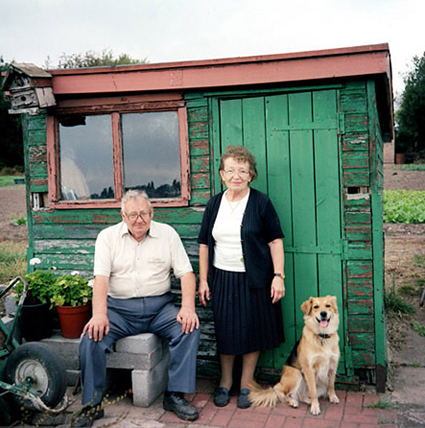
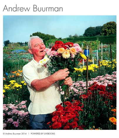
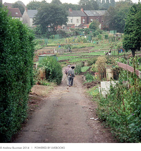
Form: All these images contain lots of colour, which reflects the joy that the owners experience from having an allotment. All of these images also contain people which show that the allotments are owned, look after well and are the pride and joy of their owners.
Process: A technical prices was not used in order to develop these photos, however the artist did produce lots of mid shots in his projects two of which are featured here, (1 and 2) and some full-body shots, one of which is featured here (3) He also mainly produced landscape shots in this project.
Keywords: COLOUR,BRIGHT,JOYFUL,OTHER WORLDLY,ESCAPE
Contexts: The project is designated to capture how distant allotments seem, and how other worldly they feel to those who spend most of their time enclosed and engulfed in the hustle and bustle of London. They are also meant to capture the pleasant tranquility that you experience once you enter a place like this. His photos also capture the sense of classic Britain that these places in the images portray, and how diverse these allotment owners have had to become due to the amount of nature disappearing from London.
My photos
Inspired by the work of Andy Buurman and his project called 'allotment' I went to take photos of my schools local allotment with my photography class.
|
|
The artist and me
One way in which my work is similar to the artist, is through how we both featured a lot of the owners property such as sheds in our photos. The main difference between my work and the artists is that he included people in his images whereas I didn’t. This is because when my class and I were at the allotments there weren’t any owners present. Another difference between my work and the artist’s is that are shooting conditions were different. This means that his photos are brighter because it was a brighter day when he took his images. Another difference is that I took lots of extreme close up shots where as the artist didn’t. This is because I wanted to display the texture in the sheds and that derelict and rusty qualities actually give them character.
Evaluation
What went well: I think that I effectively captured different interesting features of the allotments that reflect and sum-up the allotments well. I also think that I was successfully inspired by the artist’s interpretation and I think I took his photos into account when taking mine.
Even better if: My photo would have been even better if the shouting conditions were better. This would have made my photo brighter and if it had not been raining slightly, my photos of the allotment would have been clearer and better quality.
Even better if: My photo would have been even better if the shouting conditions were better. This would have made my photo brighter and if it had not been raining slightly, my photos of the allotment would have been clearer and better quality.
Visual brainstorm
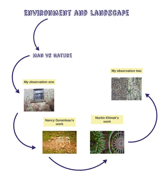
Man and Nature
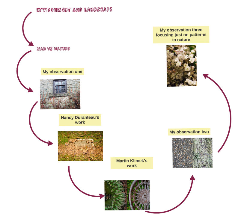
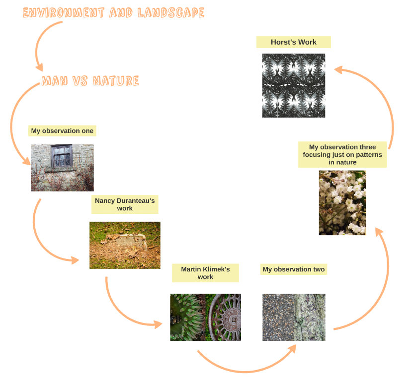
Man vs Nature
For this set of photos I decided to respond respond to the title man and nature through the Man vs Nature interpretation. Therefore through my photos I wanted to portray nature taking over man made objects and buildings as well as man conquering nature, fighting against nature and disrespecting nature.
Observation 1- My Photos
|
|
|
Nancy Duranteau
Nancy duranteau has been taking photos ever since she was little in order to depict her life. Her project 'Man vs Nature was designed to depict functioning man made object being taken over by nature and show that they are "facing an inevitable destruction at the hands of nature". she also wanted to show the constant fight between the structure wanted by man an the chaos wanted by nature. Her website: http://www.duranteau.com/
Form: This photo displayed an old slowly rotting and withering cigarette packet covered in leaves ,twigs and stones.
Process: The photo uses a close up shot to display the detail of the object and uses depth of field by having some of the surrounding twigs,leaves and stones out of focus which focuses the viewer on the center of the photo were the object is. Keyword: ROTTING,WITHERING,WEAK,WILTING, Context:one of the photographers aims was to show that nature is taking over man made objects. This clear through how this man made object originates from trees like the ones that now surround it, this aspect of the photo displays the rotting process that all object made through nature go through and shows how they return to nature in the end. This photo also displays the photographer aim that although the process this object is undergoing is natural it is despised by humans because it looks unpleasant. |
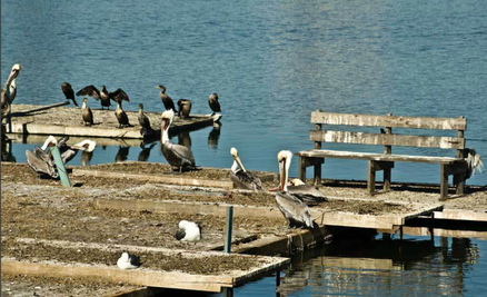
Form: This photo displays a decaying wooden pier and bench being used a resting place for lots if different birds.
Process: This photo used natural light which portrays the brightness of the water and the brightness of the birds white feathers well. This photo also uses colour contrast between the bright blue water and the dull, grotty and decaying wooden bench and pier. Keywords: CHAOS,CURIOSITY,RELAXATION Context: The use of natural light portray the nature aspect of the project more effectively that unnatural light would because the project is displaying how nature has taken over this man made object. One of the photographers aims of the project was to display the chaos that awaits all man made structures like this one, and because of the birds scattered chaotically around the pier and bench displayed here,it is clear that this aim was for filed through this photograph. 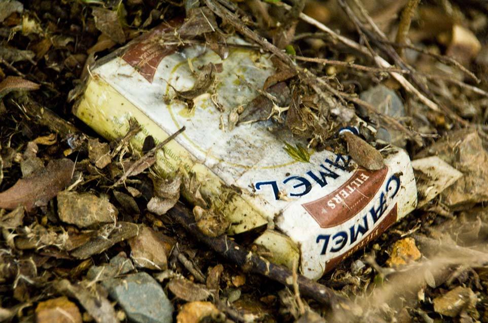
|
|
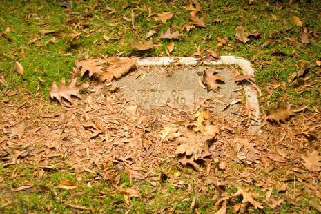
Form: This photo displays a concrete plaque displaying the location, covered in autumn leaves and being grown over by grass.
Process: This image is a zoomed in birds eye view shot, which displays colour contrast between the dull and light brown concrete/autumn leaves and between the lush green grass. This photo also displays the use of the formal entitlement line in the lines of the concrete plaque. Keywords: DESTRUCTION,CONQUERED,DEFEATED, DISAPPEARING,ENGULFED Context: One of the photographer aims was to show how nature is taking over man made objects and how "man;s attempts to create structure are undone". This photo displays this because it shows how the concrete man made plaque is becoming overgrown and engulfed by nature. This hints at the idea that this fate is inevitable and that it can not be avoided even by the sturdiest of man made objects. |
The artist and me
A similarity between my work and the artist is that we both captured that nature is taking over man- made structures. However Duranteau also depicted nature taking over using animals as well as plants. We both captured examples of litter. This is because litter is an example of how human are trying to fight against nature by destroying it, or don’t care about nature so are okay with polluting it. Another difference between my work and Duranteau’s is that she featured lots of extreme close up shots in her ‘Man vs. Nature’ project , where as I only features a few.
Evaluation
What went well: I think that I effectively reflected the theme ‘man vs nature’ through these photos. I did this by capturing examples of nature trying to take over man- made structures such as fences. I also captured images of how humans have tried to battle against nature by building stronger faces, littering, and by trying to do what nature does (portrayed in the image of a rainbow being built).
Even better if: These photos would have been even better if I had taken more photos that portrayed that humans are trying to fight against nature. This is because a lot of them display nature taking over man- made structures, and it would be interesting to compare this to how, humans are fighting against this.
Even better if: These photos would have been even better if I had taken more photos that portrayed that humans are trying to fight against nature. This is because a lot of them display nature taking over man- made structures, and it would be interesting to compare this to how, humans are fighting against this.
Visual brainstorm
Observation 2-Diptych photos
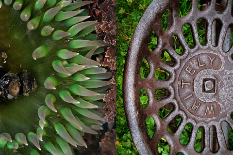
Martin Klimek
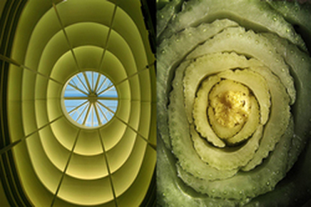
Martin Klimek lives in San Francisco and is a editorial and commercial photographer. The project that I have been inspired by is called 'Man Vs. Nature diptychs'. The project was a " creative exploration of a series of man made an natural elements through diptychs." Klimek said that he was "drawn equally to the patterns I found in both the natural and man-made worlds". All his photos are made using the Diptych technique which traditionally is the name for two or more paintings connected together with hinges.However Klimek has used this technique to connect an compare his images of nature and man made objects.
|
Form: The photo contains a lush green and unusual looking plant and made metal wheel on grass that is becoming rusty next to it with the curves in the shapes facing each other.
Process: The process is called diptychs an here is used to compare the round and circular shape of the plant with the wheel. It is also used to bring out the similarity in colours, because the plain image is green on top of brown where as the the wheel image is brown on top of green. This contrast means that as a result the images compliment each other well. Keywords: UNUSUAL,CURIOUS, COMPLIMENT,CONTRAST,BOLD,LUSH Context: The aim of this photograph was to portray the similarity in pattern between nature and man made objects and the contrast in colour that you find in nature and in man made objects. |
|
Form: This image contains a yellow/green oval structure from the inside of a building on the left, with a pattern made up of horizontal lines, diagonal lines and concentric circles inside it. On the right is a luscious and succulent looking green/yellow plant made up of slightly broken up concentric circles.
Process: In this image the diptychs technique is used to display the similarity in colour and shape in the man made structure and in the plant. It also displays the similarity in the concentric circles that are featured in both images, however the man made structure, has ones that are more concise. Keywords: OVAL,BRIGHT,SUCCULENT,LUSCIOUS, SIMILARITY, Context: For this image the photographer's aim is to display the similarity between man made structures and the structures found in nature. He is also displaying how much humans are inspired by nature and that for this reason, it shouldn't be destroyed. |
|
My photos
For my diptych photos I wanted to focus more on the how the patterns in man made structures and the patterns in natural structures project and give off similar atmospheres, and moods the as well as how the structures themselves relate to each other. This is my reason for doing the music and tree diptych because they present the viewer with the same atmosphere and mood.
|
|
The artist and me
The main difference between my work and the artist is in the aims of work. Klimek wanted to show visible similarities between the patterns in nature and the pastures in man-made structures, whereas I also wanted to show the similarity in mood. This is my reasoning for doing the image with the trees and the sheet music. A similarity between my work and Klimek’s is that we both captured the patterns using extreme close up shots. We did this in order to make it hard for the viewer to guess where the pattern is from. It also allows the viewer to look at the pattern, as just patterns instead of objects.
Evaluation
What went well: I think I took close ups shots of man-made structures and natural structures well, because they are clear and reflect the subject well. I also feel that I successfully picked out some interesting patterns form the man made world and the natural world,
Even better if: This observation would have been better if I had matched the man made patterns with the natural ones better. This would have made the diptych images look interesting because the similarities between natural structures and man-made structures would have been clearer.
Even better if: This observation would have been better if I had matched the man made patterns with the natural ones better. This would have made the diptych images look interesting because the similarities between natural structures and man-made structures would have been clearer.
Visual brainstorm
Observation 3 My photo-Patterns in nature
Through these photos I decided that I would develop my diptych observation by concentrating on just patterns and structures in nature. Through these photos I used different types of shots in order to capture the patterns and structures, therefore I took bird's-eye view shots, worm's-eye view shots and close ups to capture the colour
|
|
Evaluation
What went well: I think that I captured different patterns and structures in nature well through my images. I think this is clearest through image 8 and 12 in the slide, 8 being an image of flowers and 12 being an image of tree branches. This because the images feature a clear pattern but the viewer can still tell what subject of the image is.
Even better if: These images would have been even better if I had had brighter lighting which would have made the images clearer. I could help this a bit by changing the aperture on my camera but this didn’t improve the images as much as I wanted.
Even better if: These images would have been even better if I had had brighter lighting which would have made the images clearer. I could help this a bit by changing the aperture on my camera but this didn’t improve the images as much as I wanted.
Visual brainstorm
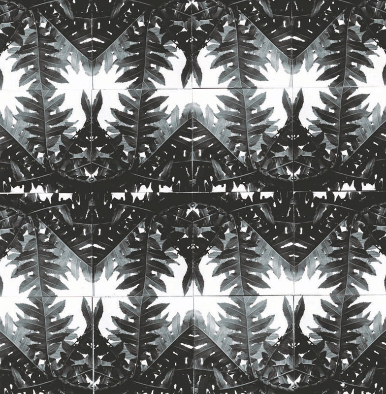
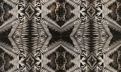
Observation 4-Horst Patterns from nature
Horst was born on 14 August 1906 and is described as a photographer of style and"created images that transcend fashion and time. He was a master of light, composition and atmospheric illusion, who conjured a world of sensual sophistication" as the V&A said. Many of his photos have been featured In Vogue.His first credited photograph was published in the December 1931 issue of French Vogue, and was a full-page advertisement of a woman dressed in black velvet holding a Klytia scent bottle in one hand whilst holding the other above her in an elegant fashion. In order to create this image Horst "selected a detail from one of his one of the photographs and printed the negatives as shot and in reverse." He then developed the kaleidoscopic- like collage using 16 individual prints and producing a repeated pattern. Sources: http://www.horstphorst.com/abouthorst.php, http://plantcurator.com/how-to-horst-your-patterns-from-nature/.
|
Form:This photo contains a photo of a leaves that have been repeated and reflected mutable times, to create a complex interesting pattern.
Process: Horst produced this image using the process mentioned above, but for this image in particular the colour contrast between the black and white is prominen. The bright white in the photograph brings out the detail and the change in tone in the leaves. Keywords: KALEIDOSCOPIC,ELEGANT, DETAIL, CONTRAST Context:I think Horst's aim for this photograph was to portray the elegance and detail that can be found in nature, but also that we can enhance the beautiful patterns and details that we find in nature and develop them into a more intricate of our own. Form: For this image Horst used a more narrow shaped leaf to produce this unique pattern, and this pattern also looks more kaleidoscopic that the other photograph.
Process: For this photograph, Horst used the process mentioned above. This image looks has even more interact detail that the other photo. It also looks aggressive and therefore less elegant that the other photo. Keywords: DETAIL, SHARP, AGRESSIVE,FREARS Context: For this image I think Horst's aim was to bring out the sharp and aggressive aspects of nature, but also to develop the kaleidoscopic elements of his photographs further. |
|
My Photos
|
|
|
Process
|
|
The artist and me
The main difference between my work and the artist is that we used different techniques in order to produce our images. Horst "selected a detail from one of his one of the photographs and printed the negatives as shot and in reverse,” where as I used Photoshop. This means that his photos were restricted to black and white as well, where as I originally produce my images in colour. Another difference between my work and the artists is that My patterns are appear to be more detailed than his. This is because I repeated the original image more that he did, in order to make my patter. A similarity between my patters and
Horst patterns is that we both used images of leaves in order to produce our patterns
Horst patterns is that we both used images of leaves in order to produce our patterns
Evaluation
What went well: I think I successfully made beautiful looking patterns using structures from nature. I also think that I my fourth observation was successful inspired by Horst.
Even better if: I could have made better patterns if I had found more interesting structures in nature. This would have made Horst inspired patterns clearer and would have made them more distinctive and would have produced a clearer patter (number 8 on both slides). As well as this I should have tried to make the original photo less obvious in some of the pattern which would have made it more similar to Horst’s patterns. For example I could have done this form the roses pattern (number 5 on both slides)
Even better if: I could have made better patterns if I had found more interesting structures in nature. This would have made Horst inspired patterns clearer and would have made them more distinctive and would have produced a clearer patter (number 8 on both slides). As well as this I should have tried to make the original photo less obvious in some of the pattern which would have made it more similar to Horst’s patterns. For example I could have done this form the roses pattern (number 5 on both slides)
Visual brainstorm
observation 5-Patterns in man made structures in the style of Horst
|
I decided to develop my forth observation by going back to man-made structures and patterns and developing Horst inspired pattern using man-made structures, such as walls, buildings and the seating on the London underground.
|
Evaluation
What went well: I think I successfully produced unexpected and interesting patterns from man-made patterns and structures, that weren’t always appealing or were over looked. I also think that I successfully developed my forth strand, because I took my Horst patterns a step further but also linked them back to a pervious task.
Even better if: This observation would have been even better if I had produced more appealing and pleasant to look at. This would have made them more similar to the Horst patterns from observation four.
Even better if: This observation would have been even better if I had produced more appealing and pleasant to look at. This would have made them more similar to the Horst patterns from observation four.
Visual brainstorm
Observation 6
I then developed my images further, by using my Horst images and making them into diptych photographs, picking out the similar patterns found in my nature Horst images and my man made Horst images.
|
|
Evaluation
What went well: I feel that I successfully match some patterns together. This allows the viewer to see both patterns in a new light and makes it harder for them to see which patters are made from structures in nature and which patterns are made from man-made structures. I feel that I also successfully matched patters together, which brought out the similarities between the man-made structure patterns and the natural structure patterns.
Even better if: This observation would have been better if I had managed to find more similarities between my nature Horst patterns and my man-made Horst patterns. This would have allowed me to make more diptych photos.
Even better if: This observation would have been better if I had managed to find more similarities between my nature Horst patterns and my man-made Horst patterns. This would have allowed me to make more diptych photos.
Visual brainstorm
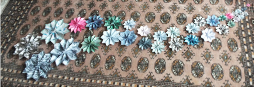
Final piece
About final piece
My final piece came from the idea of merging the natural world and the man- made world together. My final piece reflects this because I used my Horst inspired patterns made from man-made structures and objects, to make origami flowers, (which are inspired by nature). I also used my Horst inspired patterns made from structures in nature to make origami man -made flowers. This links to the title “man and nature” because it is an example of man and nature becoming merged together not being against each other.
Evaluation
What went well: I think that I developed my sixth strand well and did so in an unexpected and creative way. As well as this I think that I successfully made enough flowers to convey my message of the piece.
Even better if: The piece would have been even better f I had had more pleasant looking manmade patterns to work with. If I had made more them this would have helped. It would also have been even better if the transition from big flowers to small flowers was more gradual. I could have done this by making varying the flower sizes more.
Even better if: The piece would have been even better f I had had more pleasant looking manmade patterns to work with. If I had made more them this would have helped. It would also have been even better if the transition from big flowers to small flowers was more gradual. I could have done this by making varying the flower sizes more.
