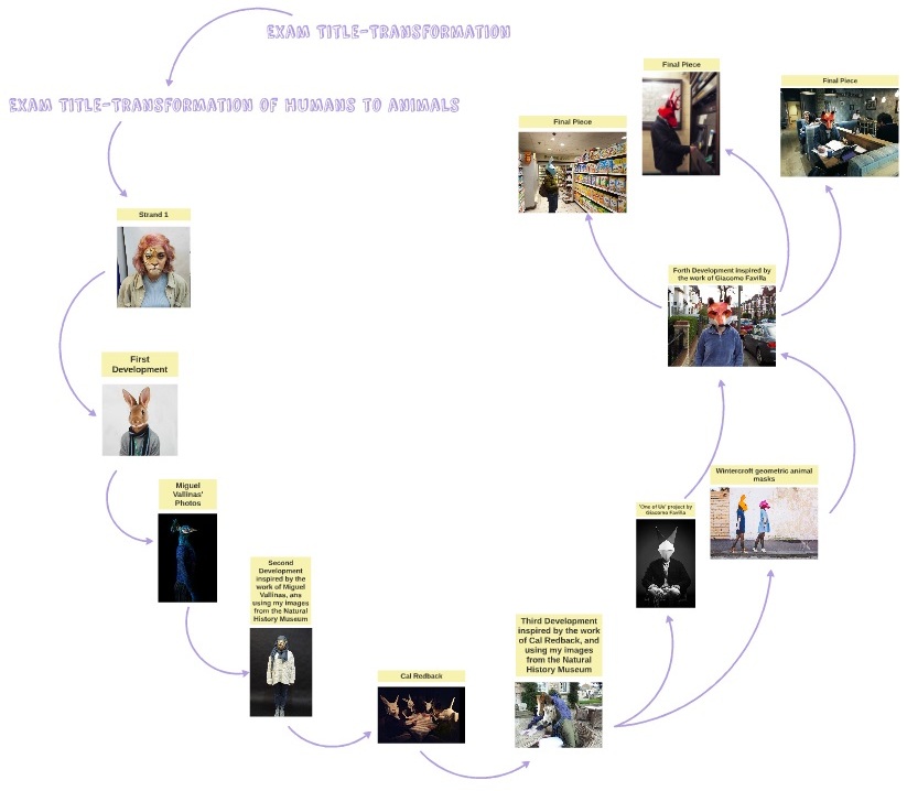
Mind Map
Transformation -Time
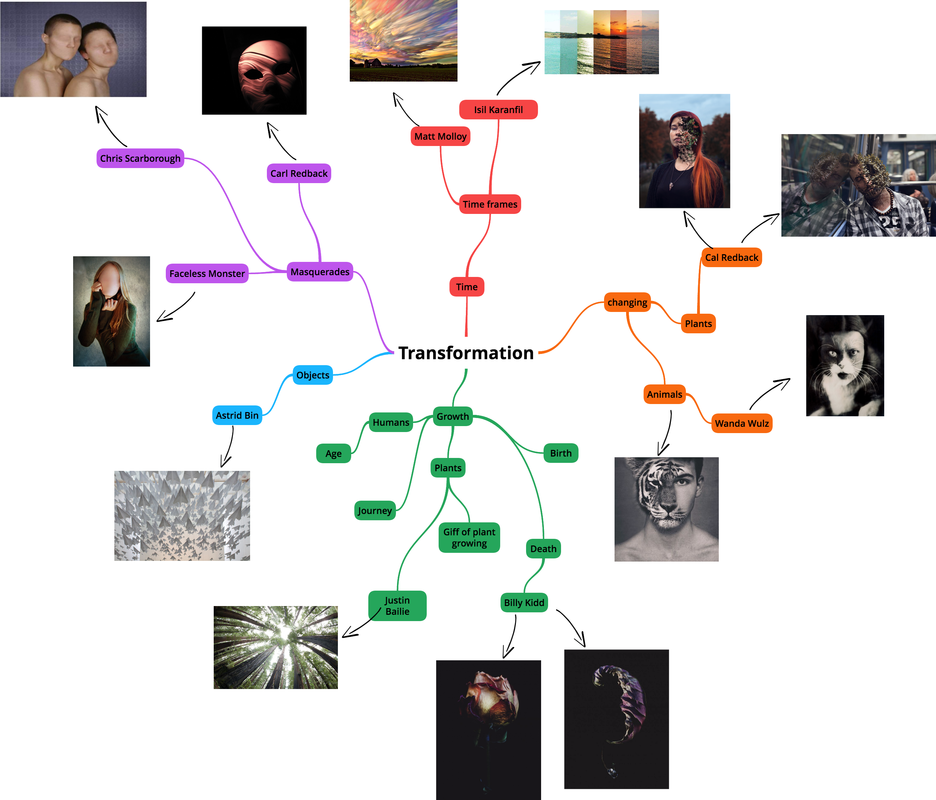
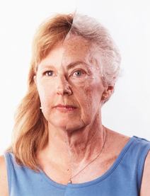
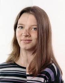
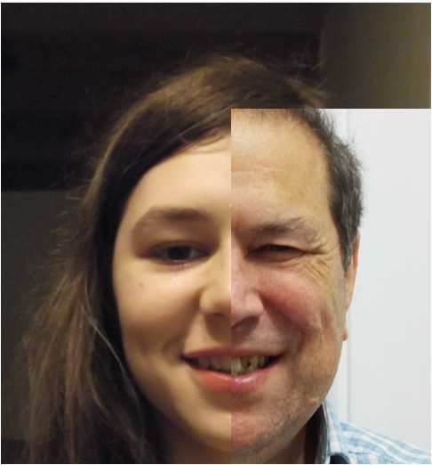
Our task was to take portraits of young people then transform them into old people by layering their face with a photo of an old persons face, on photoshop.
Process
My Photos
Evaluation |
|
What went well: I successfully was able to transform a young person into a realistic looking old person. This was done well because I used the clone tool to clone the skin of the old woman, and made sure the neck of my young subject was covered too. this blended the two skins together well making the photo look realistic.
Even better if: the second photo would have been even better if the old woman's face over the top looked less like a mask, and if the opacity of the old woman's face had been adjusted, then it would have blended into the younger subjects face more which would have made the photo look more realistic.
Even better if: the second photo would have been even better if the old woman's face over the top looked less like a mask, and if the opacity of the old woman's face had been adjusted, then it would have blended into the younger subjects face more which would have made the photo look more realistic.
Transformation-Time
Bobby Neal Adams
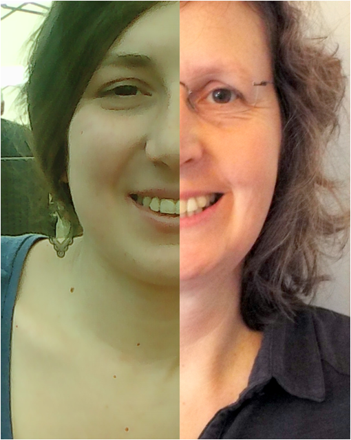
Inspired by the work of Bobby Neal Adams our task was to merged together images of different people in our family from different generations with in our family.
Context:With this project Adams wanted to represent the transformation from the young generation to the oder generation, using photographs. I think Adams chose to represent the transformation of the generations in theses families in this way because, of the sentimental value that we place on photographs of our relatives especially ones our children and parents, but also because it displays the similarities between the generations that we don't usually notice.
Form: This photograph contains half an image of an elderly mother and half of her middle aged daughter showing the transformation from the younger generation to the older generation.
Process: Adams has ripped the photo of the mother down the middle in a distorted way, and has then combined it to the other image of the woman's daughter, to create a distorted portrait. For this image, Adams has distorted the image slightly at the chin, making the image slightly uneven and appear unnatural.
Keywords: SUREAL,DISTORTED,GENERATIONS,UNEVEN
.
Form: This photograph contains half an image of a middle aged mother as the older generation and her daughter as the younger generation.
Process: Adams has ripped the photo of the daughter down the middle in a distorted way, and has then combined it to the other image of the girls mother to create a distorted portrait. For this image, Adams has distorted the image more than the other by not overlapping it perfectly. As a result the nose has multiple nostrils and the line of the model's tops are slightly distorted, making the image slightly uneven and appear unnatural.
Keywords: SIMILARITY,DISTORTED,UNNATURAL
Form: This photograph contains half an image of a middle aged father as the older generation and is young son as the younger generation.
Process: Adams has ripped the photo of the father down the middle in a jagged and ruff way, and has then combined it to the other image of the the fathers much younger son, to create a distorted portrait. For this image, Adams has made the image more obviously distorted by making the edge that she split the image on, more jagged. As well as this, for this image the different photos are clearer, because of the different coloured backgrounds of the photos, however where the photo splits at the shirt is unclear making the image seem more surreal.
Keywords: SURREAL, JAGGED,ZIG-ZAG,
My Photos
|
|
The artist and me
One difference between the artists work and mine, is that the the artist took all the photos against a white studio background, which brought out the similarities in the subjects faces better. Another difference is that unlike the artist I didn't use any photos of the third generation of a family. However, I picked up on similarities between a father an daughter and like the artist, a mother and daughter. All this makes the aim of the work stand out, to show the similarities between the different generations in one family.The main difference between my work and the artists is that I used Photoshop in order to edit my photos, where as the artist ripped the images down the middle then linked the photos together. another difference between my work and the artists is that they made sure that their subjects were wearing similar clothing and made sure that every photo was taken against a white background. This made the similarities in the subjects features more prominent.
One difference between the artists work and mine, is that the the artist took all the photos against a white studio background, which brought out the similarities in the subjects faces better. Another difference is that unlike the artist I didn't use any photos of the third generation of a family. However, I picked up on similarities between a father an daughter and like the artist, a mother and daughter. All this makes the aim of the work stand out, to show the similarities between the different generations in one family.The main difference between my work and the artists is that I used Photoshop in order to edit my photos, where as the artist ripped the images down the middle then linked the photos together. another difference between my work and the artists is that they made sure that their subjects were wearing similar clothing and made sure that every photo was taken against a white background. This made the similarities in the subjects features more prominent.
Evaluation
What Went Well: I managed to match up and a-line the photos successfully which means that you can see the similarities between the family members more clearly.
Even Better If : The photos would be even better if I matched the clothing of the subjects better like the artist did and if I had made sure all the photos were taken on a white background, which would have brought out the features and similarities of the subjects better.
Visual Brainstorm
|
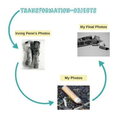
Transformation-Objects
Inspired by the work of Irving Penn and his still life and found objects photos, our task was to capture photos of different objects or pieces of litter in their natural environment, then to collect theses objects and to bring them back to the studio space to take photos of them against a white background. The aim of this task was to see whether the way we regarded the objects transformed into something different or whether the status of the object transformed once we had taken them out of their natural environment and photographed them in the studio space.
Irving Penn's Photos
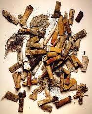
Form:This photograph displays lots of old and used cigarettes along with other bits of dirt, all scattered on a piece of paper.
Process: For the process Penn collected pieces of litter that most people would ignore and took images of them on a white background in a studio. For this shot, Penn used a bird's-eye-view shot to take this image camera. despite their dismal and dangerous connotations, the cigarettes seem quite bright, making the image seem slightly ironic.
Keywords: SCATTERED,RANDOM,BRIGHT,DAMAGE, DIRT
Context: Penn's aim was to transform the status everyday objects or litter from being something that most people would ignore, into something noticeable and into something that can cause a big impact.
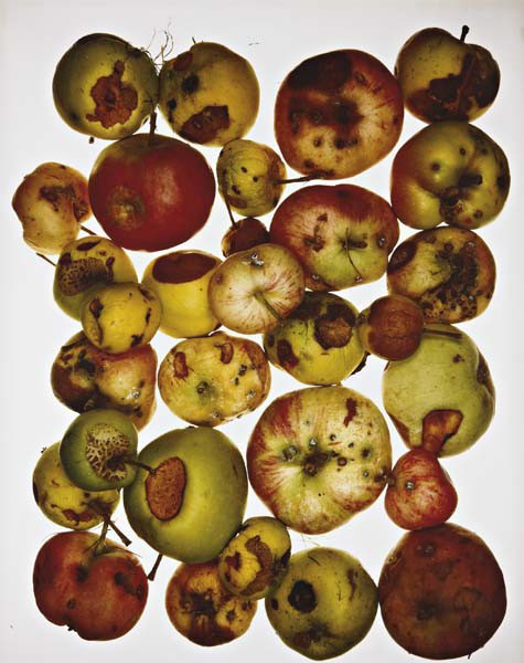
Form: This photo contains lots of rotting apples of all shapes colours and sizes,scattered very close together.
Process: For the process Penn collected pieces of litter that most people would ignore and took images of them on a white background in a studio. For this image Penn used a bird's eye view shot to produce the image and to capture how cramped bright the apples are but also to capture the assortment of colours and shapes. This shot also makes the apples seem very clinical because of the harsh white background.
Keywords: COLOURFUL,CRAMPED,SCATTERED,ROTTEN,DISTORTED
Context: For this image Penn used a bird's -eye-view shot to produce the photo. Penn used colour contrast between the colourful yellow, red and green of the apples and the white background, this makes the colours stand out more but also makes the apples seem like they still have life in them even though the are rotting away.
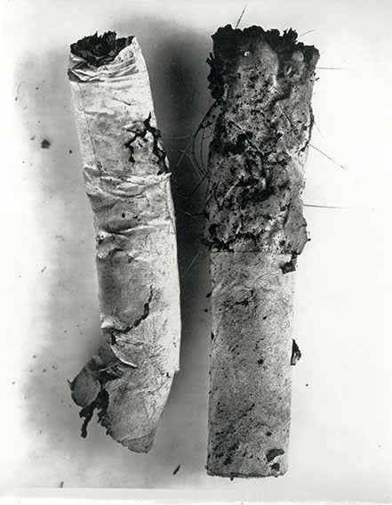
Form: This photo contains two old and used cigarettes that have been crumpled and have been left in the dirt to rot.
Process: For the process Penn collected pieces of litter that most people would ignore and took images of them on a white background in a studio. For this image Penn
Keywords: CRUMPLED, ROTTING,OLD,DISGUSTING,DIRTY
Context: For this image Penn wanted to capture how disturbing theses objects actually are and how they look like they can cause a lot more damage when they are enlarged which transforms their status.
The objects in their natural enviroment |
The objects in the studio |
We were also asked to write one word ,that we thought best described the object, on a piece of paper next to every object brought in by the class.
Cigarettes,lighter and cigarette box
words: KILLERS,DANGEROUS,DIRTY,ROTTEN
words: KILLERS,DANGEROUS,DIRTY,ROTTEN
When I took the images of the Cigarettes in their natural environment they seemed very normal and didn't have a major impact on me despite the fact that know the damage they can do. This was the same with the lighter and cigarette box, however the the lighter seemed more casual and less directly linked to the cigarettes and the cigarette box because of its bright blue colour. However when I to images of the Cigarettes,lighter and cigarette box in the studio the danger that was assorted with them became clearer against the white background mostly barbecue the "Smoking Kills" message on the cigarette box became more prominent. As well as this the dirty qualities of the cigarettes and the cigarette box became more prominent too because of the contrast between the black dirt and the white studio background. The electric blue colour of the lighter also contrasted with the white of the studio and make the lighter seem more clinical. Therefore these objects transformed from being objects that people don't regard as dangerous or harmful, to things that can cause a lot of damage.
Coke can
Descriptive words: BRIGHT,DISTORTED,SQUISHED,COMPRESSED
When I took images of the coke can in it's natural environment despite the fact that seemed very normal and expected its bright electric red colour contrasted clearly against the green leaves the brown autumn leaves. However once I had taken images of it in the studio it's distorted and squished qualities became more prominent. Therefore the coke can transformed from being something that stood out from the environment due to it's bright colours, but that was expected, to being an object that was lower in status because of it's distorted,squished and compressed qualities.
Bottle lid
Descriptive words: RUSTY,OLD,USED,WORN OUT
When I took images of the bottle lid in its natural environment it was that it blended in with the stones surrounding it because of its size and its yellow and brown colours. However once I had begun to photograph it in the studio its rusty, old and used qualities stood out more presenting it as having lots of character. Therefore the bottle lid transformed from being something insignificant and no bigger than a stone, to being an object with a surprising amount of character.
The artist and me
One difference between my work and the artists is that Penn didn't record what his objects looked like in their original location. This is because I wanted to make the transformation in status really clear. Another difference between my Images and the Penn's images is that I used multiple objects in my photos, where as Penn used lots of the same object in his photos,which creates a scattered, crowding but interesting looking photos. A similarity between my photos and Penn's is that we both shot photos against a white studio background, in order to bring out the detail in the objects. Another similarity is that we also both shot photos in black and white in order to make the detail more noticeable, and to make the images look more intense.
One difference between my work and the artists is that Penn didn't record what his objects looked like in their original location. This is because I wanted to make the transformation in status really clear. Another difference between my Images and the Penn's images is that I used multiple objects in my photos, where as Penn used lots of the same object in his photos,which creates a scattered, crowding but interesting looking photos. A similarity between my photos and Penn's is that we both shot photos against a white studio background, in order to bring out the detail in the objects. Another similarity is that we also both shot photos in black and white in order to make the detail more noticeable, and to make the images look more intense.
Evaluation
What went well: I managed to capture the objects in their natural environment well, and so the colours are clear and bold. As well as this I also managed to capture the normality of the objects in their natural environment. I also managed to capture the bold colours and of the object in the studio, this also brought out the message of the object well and made them cause a bigger impact on the viewer.
Even better if: The photos of the objects in the studio would have been even better if I had taken more photos of the objects individually, so that they had more of an impact the viewer and so the photos look less crowded.
|
Transformation-The camera
Our task was to take several different photos using different techniques. The techniques were Nivea prints, cyanotypes, pin hole camera and film camera.
How do the different techniques alter the perception of the subject?
The subject is clearer in the film camera photo which brings out the detail in the features better than the pinhole camera photo does, which brings out the emotions of the subject better. However with the Nivea prints, the curves and imprints in the profile face of the Nivea print, makes the photo look more interesting, and gives a more accurate representation of the subjects imprints compared to the cyanotype. Although the cyanotype looks more the film camera photo, because of the colour the features are less clear. The Nivea print also gives a more accurate representation of the subjects imprints compared to the cyanotype.
The subject is clearer in the film camera photo which brings out the detail in the features better than the pinhole camera photo does, which brings out the emotions of the subject better. However with the Nivea prints, the curves and imprints in the profile face of the Nivea print, makes the photo look more interesting, and gives a more accurate representation of the subjects imprints compared to the cyanotype. Although the cyanotype looks more the film camera photo, because of the colour the features are less clear. The Nivea print also gives a more accurate representation of the subjects imprints compared to the cyanotype.
|
|
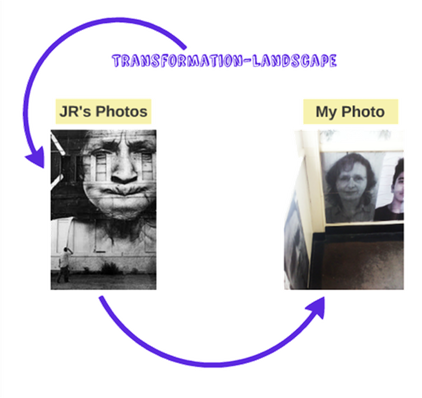
Transformation-Landscape
Photo Analysis
|
|
|
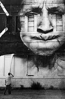
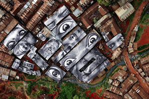
Form: These photos contain images of people with different expressions and people's features, blown up and building.
Process: JR took photographs of men an woman form different generations, focusing on head a shoulder shots and extreme close up shot of individual facial features. After converting these photos to black an white he increased the image size so that they were big enough to cover the flat roofs and walls of buildings.
Keywords: QUIRKY,BOLD,DETAILED,EXTRAVAGANT,COMICAL
Context: JR wanted to mimic the effect that graffiti has through these photos, displaying art on a free platform on places that every one can see. He wanted to bring art to the streets because he feels that "In the street, we reach people who never go to museums." The projects also evolved from his idea that the street is "the largest art gallery in the world".
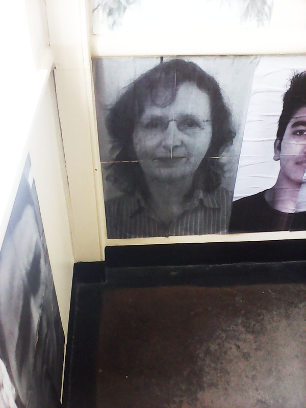
Our Task
Inspired by the work of JR our task was to transform our schools white walls by taking images of people in our local area or from our school, and placing the blown up images around the school.
|
The artist and me
The main way in which my work differs from the artists is that his photos are a lot bigger because they were designed to cover a whole wall outside, whereas mine was only designed to cover a small wall inside my school. The artist also asked his subject to pose and make interesting and funny expressions, whereas I asked my subject to pose with a neutral expression on their face in order to make the photo seem more ordinary but out of place in its final environment. A similarity between my work and the artists is that we both used images of people from the local area, raising their status in their environment and community.
The main way in which my work differs from the artists is that his photos are a lot bigger because they were designed to cover a whole wall outside, whereas mine was only designed to cover a small wall inside my school. The artist also asked his subject to pose and make interesting and funny expressions, whereas I asked my subject to pose with a neutral expression on their face in order to make the photo seem more ordinary but out of place in its final environment. A similarity between my work and the artists is that we both used images of people from the local area, raising their status in their environment and community.
Evaluation
What went well: I managed to successfully transform my area using images of people from my local area, as well.
Even better if: The image would have been even better if I had changed the contrast so that the images was brighter and clearer as a result. this would have made it stand out more on the wall.
Visual brainstorm
Tate Modern: Performing for the Camera
With my photography class, I went to an exhibition at the Tate Modern called 'Performing For The Camera'. The exhibition evolved around the theme of "the relationship between performance and photography" as Simon Baker, the curator of photography and international art at the Tate, says. The exhibition featured lost of different styles of photography using different perspectives such as the perspective of the performer and the perspective of the audience. Some photographers in the exhibition used photography to document a performance where as others used photography to document a performance that they had set up and arranged for themselves. The exhibition explored the transformation of photography form the 19th century when photography was invented to the ''selfie' and social media culture of today.
With my photography class, I went to an exhibition at the Tate Modern called 'Performing For The Camera'. The exhibition evolved around the theme of "the relationship between performance and photography" as Simon Baker, the curator of photography and international art at the Tate, says. The exhibition featured lost of different styles of photography using different perspectives such as the perspective of the performer and the perspective of the audience. Some photographers in the exhibition used photography to document a performance where as others used photography to document a performance that they had set up and arranged for themselves. The exhibition explored the transformation of photography form the 19th century when photography was invented to the ''selfie' and social media culture of today.
My favorite works
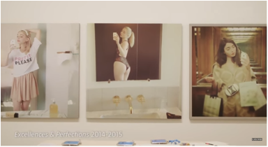
Amalia Ulman-'Excellences & Perfections'
Amelia Ulman's work, 'Excellences & Perfections,' showcased the ' selfie' and social media culture featured in the exhibition. Ulman documented her semi-fictionalized life using on three 'Instagram' accounts showing how she has transformed through her life. She wanted to showcase the idea that for many of the privileged users of social media, it is a platform which allow them to show off, sell and advertise the lifestyle they lead. Amelia Ulman wanted to replicate this type of lifestyle through the three Instagram accounts. Each Instagram account evolved around a different theme/ type of person. The first Ulman described as innocence, Tumblr Girl, manga, anime, cuteness2. She described the second as: Sin,Gangsta, ghetto crazy bitch, sugar baby. She described the third as : Redemption, normalization, the girl next door Miranda Kerr. Amelia Ulman talked about the project on a filmed discussion panel in London, called "Do You Follow? Art in Circulation," co-presented by Rhizome and the ICA. During the discussion she described her project as a "four month long performance, a full immersion in screen reality". She went on to say "Inspired by all those Korean girls's Instagram I checked every morning, and who's life pluses I get from their daily selfies, I wrote a story in pictures" Ulman went on to say " I manipulated the rhythm of my online presents narrative, to prove how easy it is to manipulate an audience through images." This , I believe, was her overall aim of the project.
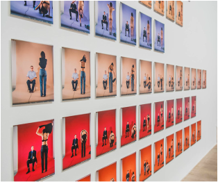
Jemima Stehli-'Strip'
My other favourite work from the exhibition was by Jemima Stehli. A lot of Stehli’s work often involves the question; can the female body be used to take back power, despite the fact that it is objectified regularly? Stehli’s work ‘Strip’ featured at the exhibition also evolved around this question. Her work involved her striping in front of male curators; contemporary artists and critics that she knows form her personal and work life. The men were positioned in front of Stehli and held the trigger for the camera which was behind Stehli, meaning that they had control over the camera and could decide when to take the shots. The artist herself said “Those people mattered to me in my career – some of them were quite powerful. I was highlighting the submissive relationship between them and me – as a woman". The artist also has talked about the aim of the project, saying that "It’s asking what they think about me as a woman and a naked body, as well as me professionally.” Through the shots, her aim was also to show the tension in the room through the images, and to show that the uncomfortable thing about the images is the self-consciousness of the men. This links back to the idea that despite the fact that the men were controlling the camera, the work still represents the reversal of power.
Tate Modern Task
Our task was to take photos of patterns in the Tate modern and and in other buildings and man made structures. This included transforming a man made structure or building into something beautiful and/or interesting, and transforming the perspective of the image.
|
|
Strand 1
|
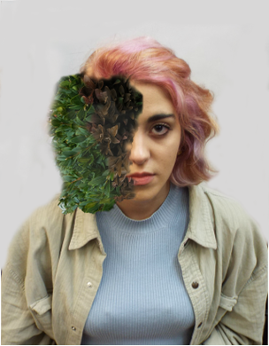
My first strand is inspired by the work of Cal Redback and his project called "Treebeard". Redback photographs in this project capture the transformation of a human turning into a plant. Using Photoshop to blend the plants into peoples faces he explores the idea of humans transforming into or being take over by nature. The end result is that the photographs appear to be supernatural, surreal and strangely beautiful. Cal Redback is a photographer and a creative-retoucher who uses different effects to create out of the ordinary and unusual photography.
website:https://500px.com/calredback |
|
My photos
The artists and me
My work differs form the artists, mainly because the leaves and plants in their images are more detailed, blended in better and therefore look more effective. The artist has also made the plants mould and fade into the face of the subject better. However the artist and I both used Photoshop in order to create our photos and we both got our subjects to face the camera in order to make the final photos look more effective.
My work differs form the artists, mainly because the leaves and plants in their images are more detailed, blended in better and therefore look more effective. The artist has also made the plants mould and fade into the face of the subject better. However the artist and I both used Photoshop in order to create our photos and we both got our subjects to face the camera in order to make the final photos look more effective.
Evaluation
What went well: I managed to blend the leaves into the skin slightly, by using the eraser tool and by gradually changing the colour of the plant so that it blended into the colour of the skin.
Even Better if: The image would have been better f I had managed to blend the leaves into the skin even better, which would have made the transformation from human to plant clearer and more effective because it would look like the plant was growing out of the subjects face. I would also have been better if I had curved to the shape of the face of the subject, which would have made the transformation more effective.
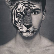
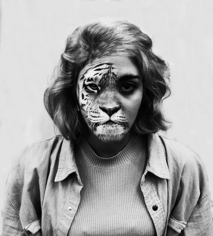
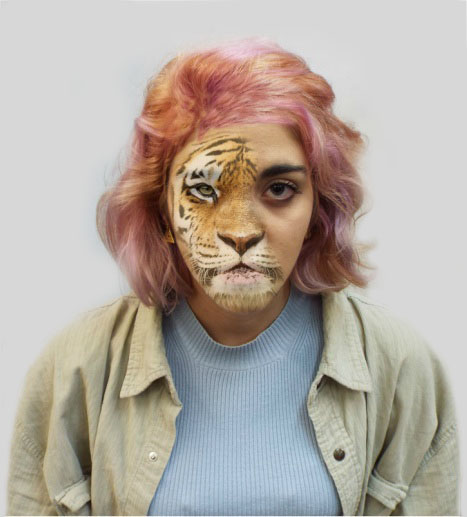
Strand 2
|
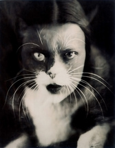
My second strand is inspired by an artist on Pinterest and the work of Wanda Wulz displayed in her project Cat and I who have both developed the idea of merging an animals face with a humans face humans. Wander Wulz made her Cat and I photos in 1932 and therefore , unlike the Pinterest photographer, did not use Photoshop to produce her images. Wulz used a technique called superimposition to produce her photo, in which one photo is placed over the other and the two images are merged together. She printed two negative photos, one of her face and one of the cats face , on the same piece of photographic paper to create the merged image.
The Pinterest photographer merged an image of a tiger with an image of a human using Photoshop. |
|
My Photos
|
|
The artist and me
The artists and I both used cats as the animal to transform the face. This is because the pattern of their fur stands out in black or white and because it contrasts well with human skin.However my photo from the artists photo due to how they both used solid colour black / dark grey backgrounds, wheres as I used a light grey background for my images,Because I thought this would bring out the bright and bold colours better. Another difference is that I dressed my subject in every day clothes where as the artist did not. I did this because I wanted to make it look like that a normal human was transforming into an animal.
The artists and I both used cats as the animal to transform the face. This is because the pattern of their fur stands out in black or white and because it contrasts well with human skin.However my photo from the artists photo due to how they both used solid colour black / dark grey backgrounds, wheres as I used a light grey background for my images,Because I thought this would bring out the bright and bold colours better. Another difference is that I dressed my subject in every day clothes where as the artist did not. I did this because I wanted to make it look like that a normal human was transforming into an animal.
Evaluation
What went well: I managed to mold the tiger face to the human face well, which means that it looks like the fur if the tiger is growing across the face of the human. As well as this I also managed to get the proportions of the features right which also adds to the effect.
Even better if: The image would look better if I the mouth of the tiger was clearer but because I had to blend it into the subjects features, the photo came out this way. As well as this I would have been better if the light in the black an white photo wasn't as dark around the eye, however this does add a sinister look to the photo.
Even better if: The image would look better if I the mouth of the tiger was clearer but because I had to blend it into the subjects features, the photo came out this way. As well as this I would have been better if the light in the black an white photo wasn't as dark around the eye, however this does add a sinister look to the photo.
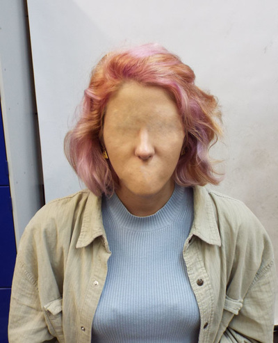
Strand 3
|
My third strand is inspired by the work Chris Scarborough and his project in which he erases people's facial features using Photoshop. Many all over the internet have used the same technique to produce similar photographs.
|
|
Process
|
|
My Photos
|
|
The artist and me
The artist and I both captured the curves and imprints in our subjects faces, which makes the loss of features look more realistic. However the artist brought out the curves in the eyes more than I did, which makes the image more disturbing and sinister. Another similarity between the artist photos and mine is that we both used solid colour backgrounds, in order to bring out the transformation more. The artist also used multiple subjects in some of their photos, which makes it seem like the subjects think that having no features is normal, representing the theme transformation from have features to being featureless, and representing the transformation from being different to being excepted.
The artist and I both captured the curves and imprints in our subjects faces, which makes the loss of features look more realistic. However the artist brought out the curves in the eyes more than I did, which makes the image more disturbing and sinister. Another similarity between the artist photos and mine is that we both used solid colour backgrounds, in order to bring out the transformation more. The artist also used multiple subjects in some of their photos, which makes it seem like the subjects think that having no features is normal, representing the theme transformation from have features to being featureless, and representing the transformation from being different to being excepted.
Evaluation
What wen well: I successfully captured the curves and imprints in the subjects face, making the transformation from having features to being feature-less, look more realistic. In the nose photo, I successfully blended the nose into the rest of the face which means that it doesn't look out of place and again, makes the transformation look more effective.
Even better if: The photo with the nose would look even better if I had managed to blend in the skin on top of the eyes, with the rest of the subjects skin better. This would have made the images look more realistic.
First Development
Inspired by the animal face transformationI did for my second strand, I have decided to focus my first development on transforming the whole face into an animal. I also experimented with different animals to see if this caused the same effects.
What went well: When making these images I was pleased that I managed to clone the markings oft he animals quite successfully, making the details on the necks of the models look effective and natural.
Problems I faced: I struggled when It came to deciding weather to erase the hair of the model or not because I could't decide which looked more effective. I decided for the owl face transformation, that the hair of the model accompanied the owl features well. However with the rabbit face transformation I thought worked best without hair because I felt that it would have suited the image and would have made it look to human like.
Even better if: These images would be even better if the line when the animal features end and the human features start was blended better because this would have made the transformation in the images look more effective
Second Development
Inspired by the work of Miguel Vallinas, my third strand I have decided to take full body shots of people on a black background in the studio, and then transform their faces and necks into animal features, using photos I have taken of the stuffed animals at the natural history museum. This will make the transformation form human to animal more noticeable.
|
My photos that I took of stuffed animals
|
|
|
My Photos
Artist and me
One difference between my work and the artist's is that the artist blended the heads into the bodies better that I did. This means that his animals look more convincing and realistic. As well this the artist dressed his subjects in more interesting costumes that relate to the animal slightly. This also makes the images more comical. However, a similarity is that we both used black backgrounds as this brings out the features of the subjects better. We also both got our subject to face in different directions. This meant that when we were creating our images we could use a variety of animals.
One difference between my work and the artist's is that the artist blended the heads into the bodies better that I did. This means that his animals look more convincing and realistic. As well this the artist dressed his subjects in more interesting costumes that relate to the animal slightly. This also makes the images more comical. However, a similarity is that we both used black backgrounds as this brings out the features of the subjects better. We also both got our subject to face in different directions. This meant that when we were creating our images we could use a variety of animals.
Third Development
Evaluation
What went well: I think that I blended the animal heads into the humans successfully. In order to create the effect blended them in by using the cloning tool and the eraser tool in photoshop.
Even better if: It would have been better if I had a bigger variety of animal photos to use but because it was difficult to take photos at the natural history museum, of the stuffed animals, without getting a reflection form take glass, there were only so many photos I could use.
Cal Redback
Inspired by the work of Carl Redback for my third development I have decided to take photographs of people in their natural environment doing every day activities, and then transform their face into animals using the photos of the stuffed animals, and of real animals.
Inspired by the work of Carl Redback for my third development I have decided to take photographs of people in their natural environment doing every day activities, and then transform their face into animals using the photos of the stuffed animals, and of real animals.
|
My photos
|
|
|
What went well: I think that I manage to blend and clone the fur of animals well, which meant that the pictures looked impressive and slightly more normal. As well as this, I solved my problem with the natural history museum photos, by taking photos of real animals so that as no reflection. I did this for the Alpaca face photo
Problems I faced: I found it difficult to decide whether to keep the skin on the hand of the subjects, to create contrast, or whether to cover them in fur so that the head looked less out of place.
Even better if: I would have been better if some of the animal faces on the photos looked less 2D, which would have made the photos look more realistic and effective.
Photography Exhibition- Wildlife photographer of the year 2015/16
I went to the Wildlife Photographer of 2015/2016 exhibition to see if any of the photos inspired me to expand on my developments.
|
|
Grand title winners |
My favourites of the Portfolio award winners
|
My favourite winners and finalists from the catagories-Earth's Environment |
Forth Development
My masks |
|
Inspired by the work of Giacomo Favilla and his project One of Us and by The company Windercroft , I have decided to develop my project further by make geometric animal masks using printable templates designed by Wintercorft, and take photos of people wearing them in a everyday situations.
For my first set of photos I decided to experiment with taking photos of someone in a mask just walking down the street and beginning to take photos of people wearing the mask in everyday situations. I did this so I could see what it was like to take photos of people in a mask and to see if any ideas came for how I could develop this development into my final piece.
My photos
|
|
My Final Piece
I decided to develop my idea further by taking photos of people in all three animal masks, doing everyday activities. I wanted to do this to represent that the animals are like normal humans and that they are being excepted into society.
|
Visual brainstorm
|
