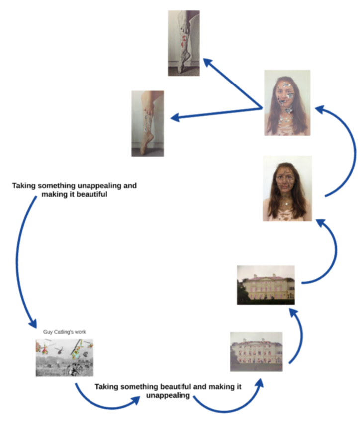
My theme and ideas
 Guy Catling-taking something unappealing and making it beautiful.
inspired by the work of Guy Catling and the photo manipulation done by many surreal photographers, my theme is juxtaposition. This links to the idea of taking something beautiful and making it less appealing and Guy Catling's work, which consists of taking something unappealing and making it beautiful.
Development 1
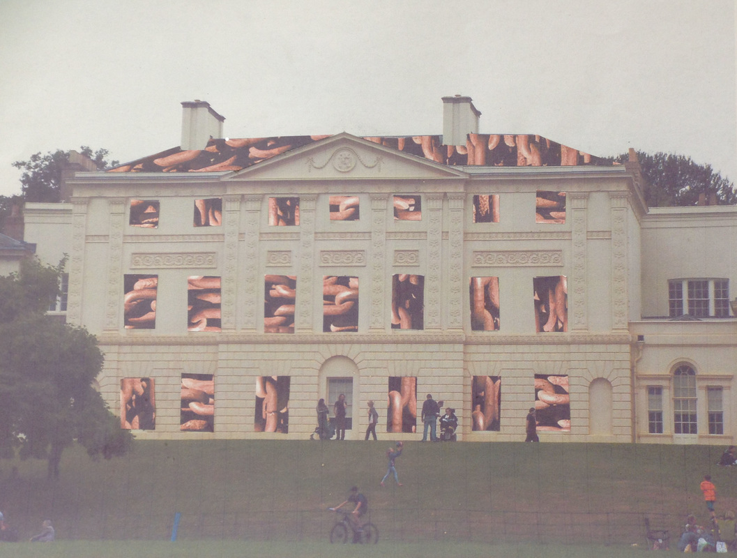
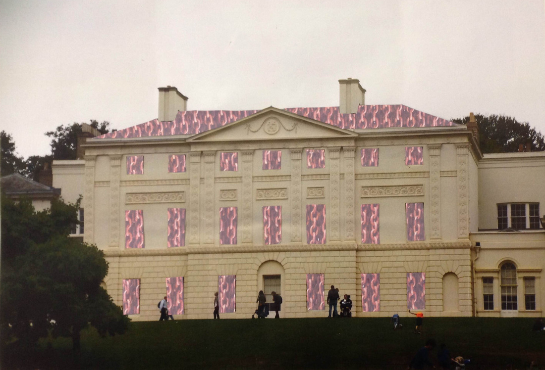
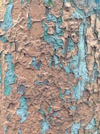
For my first development I flipped guy Catling's theme , by making something beautiful into something unattractive. I therefore photographed Kenwood house, an stuck a pattern made of chains on the windows and the roof of the building. I used chains to relate the building to the dark history of the people who lived there.
In 1756 Lord Mansfield bought Kenwood house for him and his wife. From 1756 to 1788 he served as Lord Chief Justice and during this time he ruled on many important cases. On his most famous cases was the Zong case as a result of the Zong massacre in 1781. in 1781 142 African slaves were thrown into the Atlantic ocean, off as slave ship called the Zong. The reason the crew gave for throwing the slaves overboard, was supposedly due to a shortage of drinking water that followed several navigational errors. Due to the loss of the slaves, the owners of the ship made an insurance claim, but the insurance company refused which resulted in a court case in 1783. Lord Mansfield ruled in favour of the insurance company, but did refuse to find the captain of the ship guilty of murder. On paper, it seemed that his decision was more due to the legality of the claim and less so the humanitarian causes. However many historians do believe that his close relationship with his adopted mixed-race daughter influenced his decision for this trial and for others.
In 1756 Lord Mansfield bought Kenwood house for him and his wife. From 1756 to 1788 he served as Lord Chief Justice and during this time he ruled on many important cases. On his most famous cases was the Zong case as a result of the Zong massacre in 1781. in 1781 142 African slaves were thrown into the Atlantic ocean, off as slave ship called the Zong. The reason the crew gave for throwing the slaves overboard, was supposedly due to a shortage of drinking water that followed several navigational errors. Due to the loss of the slaves, the owners of the ship made an insurance claim, but the insurance company refused which resulted in a court case in 1783. Lord Mansfield ruled in favour of the insurance company, but did refuse to find the captain of the ship guilty of murder. On paper, it seemed that his decision was more due to the legality of the claim and less so the humanitarian causes. However many historians do believe that his close relationship with his adopted mixed-race daughter influenced his decision for this trial and for others.
|
Contact sheet
|
|
What went well:I feel that this photograph went well because I managed to get the shape of the roof and a majority of the shapes of the widows perfect.
Even better if: this mock up would have been better if I had measured the rectangle windows better because this would have prevented the some of them looking wonky. As well as this, it would have been better if I had used a different photograph for the chains because in the one I used, cut up it doesn't resemble chains.
Even better if: this mock up would have been better if I had measured the rectangle windows better because this would have prevented the some of them looking wonky. As well as this, it would have been better if I had used a different photograph for the chains because in the one I used, cut up it doesn't resemble chains.
I decided to make this photograph a mock up and try again with better quality printing and with a different chain pattern that made the chains clearer.
|
The artist and me
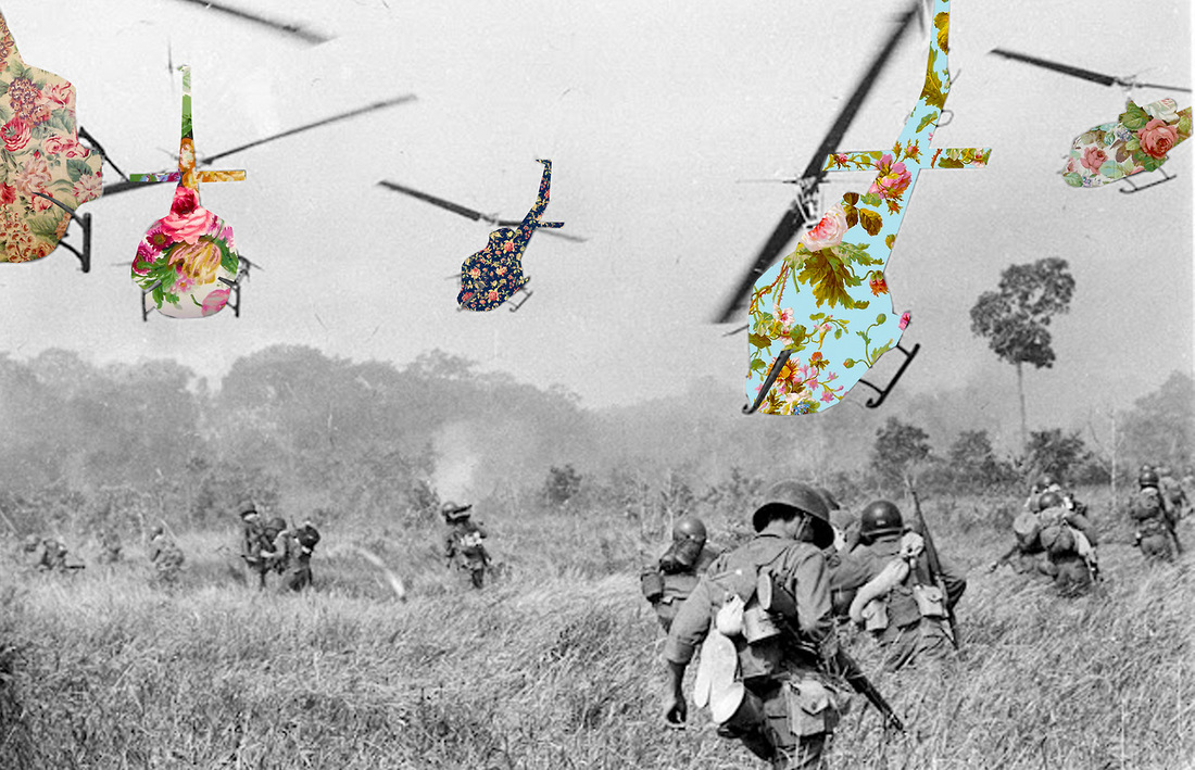
The main difference between my work and the artists, is the way we juxtaposed our photographs. The artist, Guy Catling, took a photograph of something unappealing or unpleasant, such as helicopters from the war , and turned them into something beautiful. For my photographs I did the opposite, I took a photograph of something beautiful and appealing and turned it into something unappealing and disturbing. Another difference between my work and the artists is that the pattern I used to change the photograph brings out the dark history of the location where as the patterns on the artist's photographed are designed to show how war is often glamorised and to change are perception of reality. A similarity between the artist's work and mine is that we both applied our patterns manually instead of digitally.
What went well: I am happier with this photograph because the shapes of the windows and the shapes of the roof were measured better that they were for the mock up. This made the overall piece look neater.
Even better if: This photograph would have been even better if the chains were a bit less orangey, but the pattern does display the chains better. As well as this I could have taken a different aproch and placed the chain pattern on the outside of the building to display the opinion of the world, and then placed a flower pattern on the house to display the rare kindness of the owners of the house. This would have related to the history of the houses owners and their opinions more.
Even better if: This photograph would have been even better if the chains were a bit less orangey, but the pattern does display the chains better. As well as this I could have taken a different aproch and placed the chain pattern on the outside of the building to display the opinion of the world, and then placed a flower pattern on the house to display the rare kindness of the owners of the house. This would have related to the history of the houses owners and their opinions more.
Development 2
Continuing with the theme of taking something beautiful and making it ugly, I decided to use photo shop to create a cracked and pealed face. I did this by first photographing cracked and pealing paint and then layering it onto of the portrait I had taken.
Cracked/ Pealing paint and contact sheet
|
|
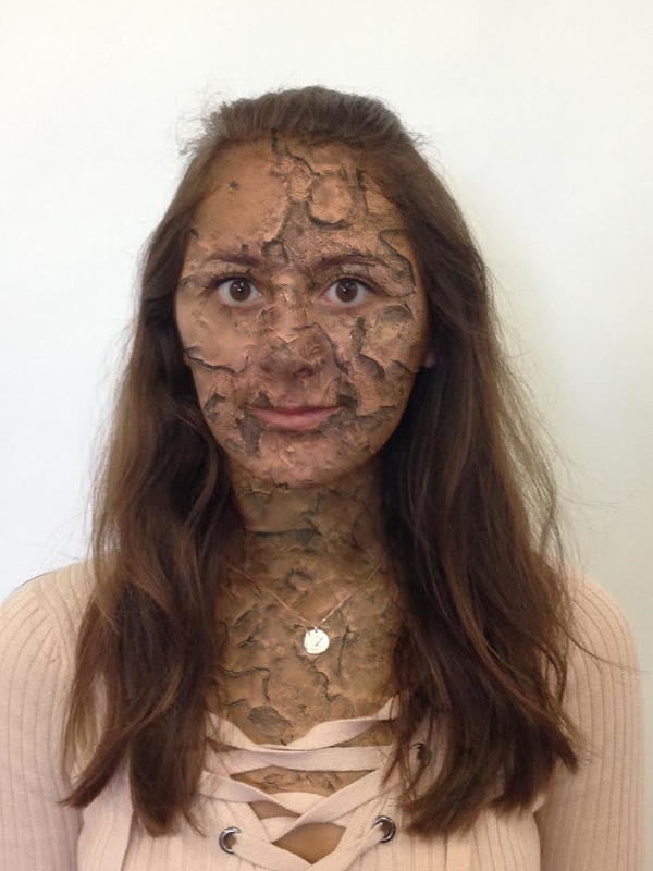
What went well: I feel that I successfully cracked and pealed the subjects face and made it look realistic. I feel that I placed the photograph of the cracked paint effectively, resulting in the cracks seemingly fitting in certain places of the face, for example the pealing underneath her lips.
Even better if: I feel that this photograph could have been even better if I had dressed up my subject more, and made her look more glamours. This would have made the the theme of making something beautiful ugly clearer.
Even better if: I feel that this photograph could have been even better if I had dressed up my subject more, and made her look more glamours. This would have made the the theme of making something beautiful ugly clearer.
I also tried doing the pealed and cracked face manually. Using the same photograph of the pealing paint, I stuck it behind the portrait of the subject and pealed away the portrait which revealed the pealing paint underneath.
|
|
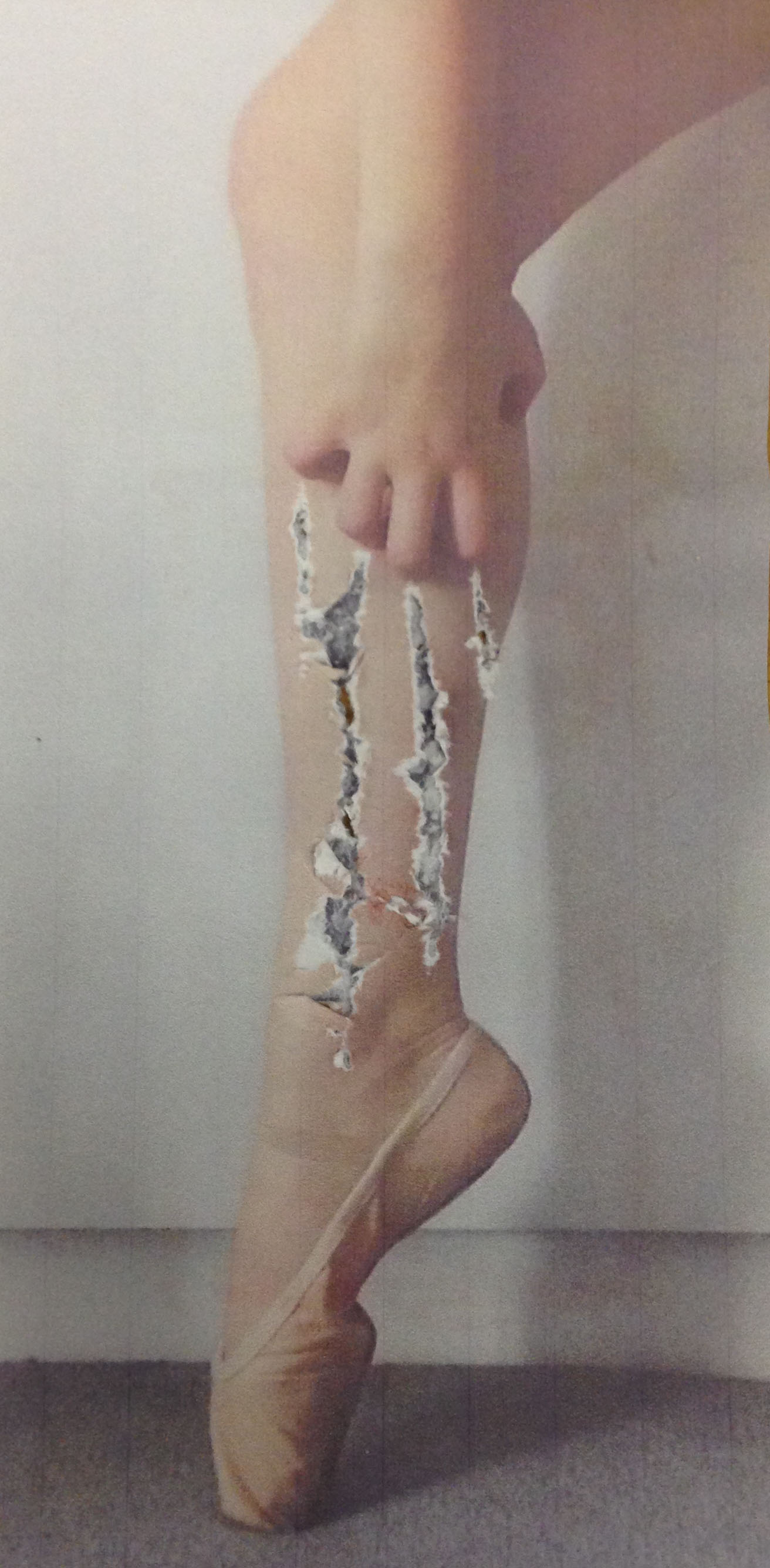
Development 3
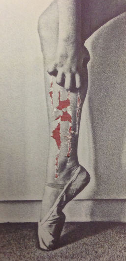
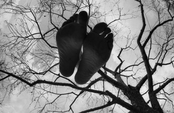
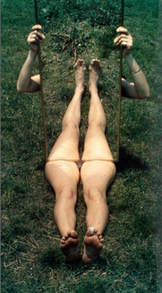
Focusing on the idea of distruction, I created these photographs of a ballet dancers foot. My aim of theses images was to revilal the pain and the uglyness behind the beauty of dance.
|
|
Visual Brainstorm
|
Development 4
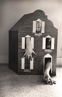
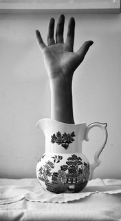
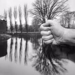
Inspired by the work of Arno Rafael Minkkinen, and a pervious student Lydia Francis, I decided to go down a more surreal root and start experimenting with limbs emerging from objects.
Lydia Francis' work
Arno Rafael Minkkinen's work
Process |
Final Photographs
|
|
What went well: I feel that I effectively blended in the limbs resulting in the the origin of the limbs being unknown, creating the surreal effect.
Even better if: These photographs would have been even better if I had not changed the location of the objects, for example if I had photographed the chest of draws on a table. This would have made the overall photograph more surreal because then only the hand would have looked out of place,not the chest as well. Also if I had grasped the photoshop technique better then the images would have been more effective.
Even better if: These photographs would have been even better if I had not changed the location of the objects, for example if I had photographed the chest of draws on a table. This would have made the overall photograph more surreal because then only the hand would have looked out of place,not the chest as well. Also if I had grasped the photoshop technique better then the images would have been more effective.
Development 4
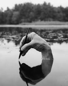
In relation to the work of Arno Rafael Minkkinen, I am moving on with the limbs images by taking photographs with limbs in and incerted into city skylines and different locations.
Contact sheet
|
|
|
|
Development 5
Linking to how the photographer Arno Rafael Minkkinen also uses refelction in some of his images, I have decided to reflect my limbs images and also reflect some landscape images.
Contact sheet
|
|
Process
|
|
Development 6
Continuing with the theme of reflection, I have decided to work on reflecting images of people. I therefore tried showing several reflection of the same erson in the same image.
|
|
|
|
Process
|
|
Development 7
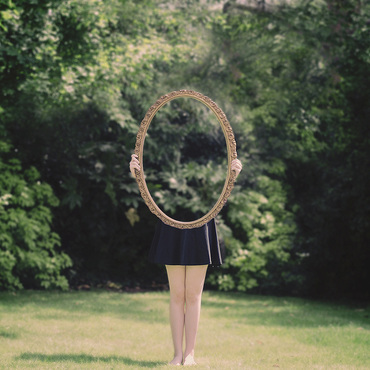
Inspired by the work of Laura Williams, I have decided to expand from reflection by creating mirror ilusion photography.
Laura Williams' work
|
|
Process
Contact sheet
|
|
My selected images
|
|
Development 8
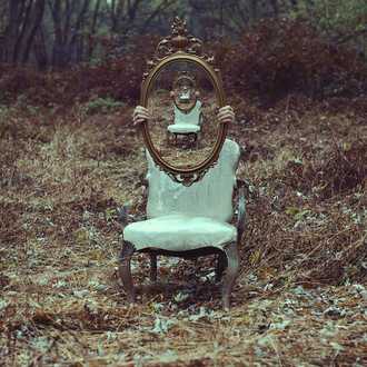
I deciced to develop by trying to reflect multitple images of the same image in the mirror. Here is an example by the photographer Christopher Ryan Mckenney.
The artists photograph
|
Process
My Photograph
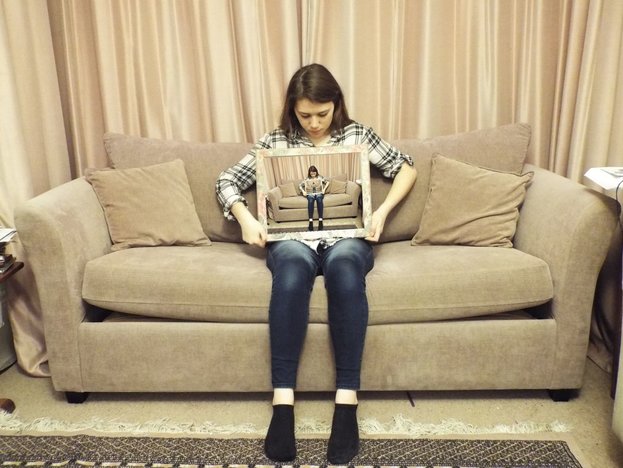
Development 9-Final Piece
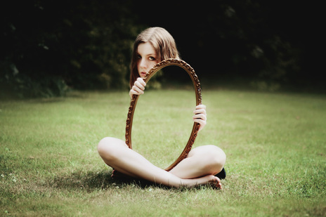
I decided to develope futher by placing different and juxtoposing reflections in the mirror the subject is holding
|
|
What went well: With these photographs I sucessfully created a colour contrast between the original photograph and the photogrpah in the mirror.
Even better if: These photographs would be better if the images I had chosen to place in the mirrors jusxtaposed form the original photograph more. As well as this they could have been better if my subject had been more relaxed in the photographs.
Even better if: These photographs would be better if the images I had chosen to place in the mirrors jusxtaposed form the original photograph more. As well as this they could have been better if my subject had been more relaxed in the photographs.
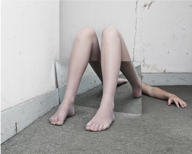
Development 10
I have decided to develop further by distancing from photo manipulation and focusing more on real reflections, and making the human body look unreconisable.
Marylene Rutten Joan Jonas
|
|
Contact sheets
|
|
My Photographs
|
|
Development 11
I decided to experiment more with focusing on reflecting my head or hands with the table on a flat surface. I also experiment with breathing on the mirror and reflecting using a glass.
Contact sheets
My photographs
|
|
What went well: These photographs were successful because they're eerie qualities created by the black and white and the piercing stare of the eyes. These elements and the reflection itself also make the photographs appear surreal.
Even better if: These Images would have been even better if the background had been less busy or a block colour because the window distract from the subject in the foreground of the image. As well as this if my face had been in the centre of the photograph it would have made photograph 2 more symmetrical because my hands would have been even.
Even better if: These Images would have been even better if the background had been less busy or a block colour because the window distract from the subject in the foreground of the image. As well as this if my face had been in the centre of the photograph it would have made photograph 2 more symmetrical because my hands would have been even.
Development 12
I then decided to focus on on just reflecting the face and being more creative with the reflections I create. As well as this I covered the background with white paper to create a block colour background.
|
|
My Selected Images
|
|
What went well: The stark contrast between the black and white makes theses photographs successful. As well as this the angle of the mirror allowed me to experiment freely and creatively with different reflections, resulting in a variety of different angles in the photographs.
Even better if: The photographs would have been even better if the background of the photograph had been a block colour.
Even better if: The photographs would have been even better if the background of the photograph had been a block colour.
Development 13
I decided to develop further by using Photoshop to change the background of my three best photographs to the block colour of white.
|
|
What went well: These photographs worked well because the block white background doesn't distract from the subject f the photograph. As well as this, the blank background makes the reflection seem fake.
Even better if: These photographs would be more successful if I had developed the theme of surrealism more which would brought out the theme of the blurred line between reality and fantasy more.
Even better if: These photographs would be more successful if I had developed the theme of surrealism more which would brought out the theme of the blurred line between reality and fantasy more.
Development 14-Final piece
I developed my previous photographs further by using the idea of blurring the lines between fantasy and reality. I therefore decided to reflect the reflection. This makes on reflection real and one reflection fake, which reflects the theme I wanted and makes the photographs more surreal.
|
|
